CREATIVE ART DIRECTION
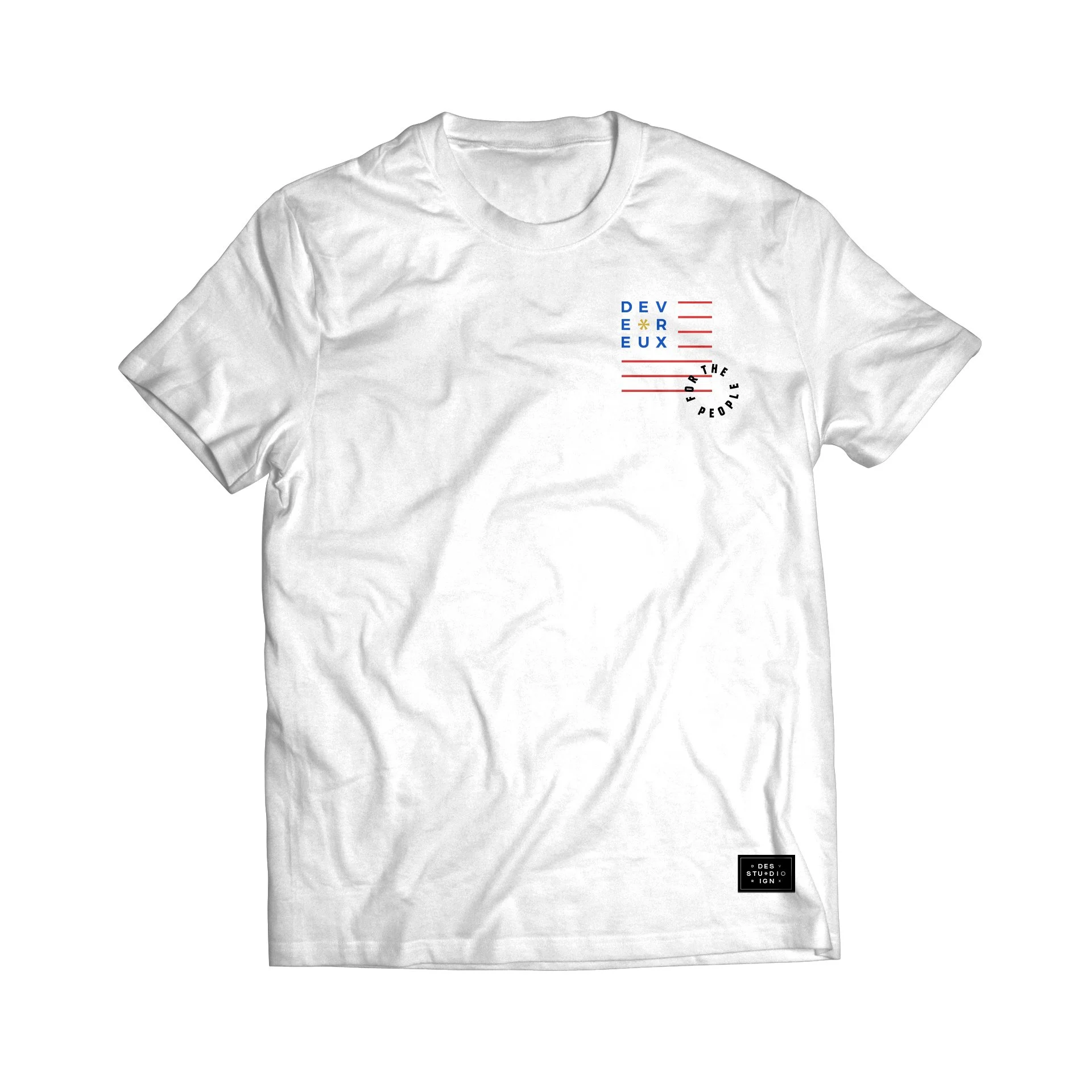
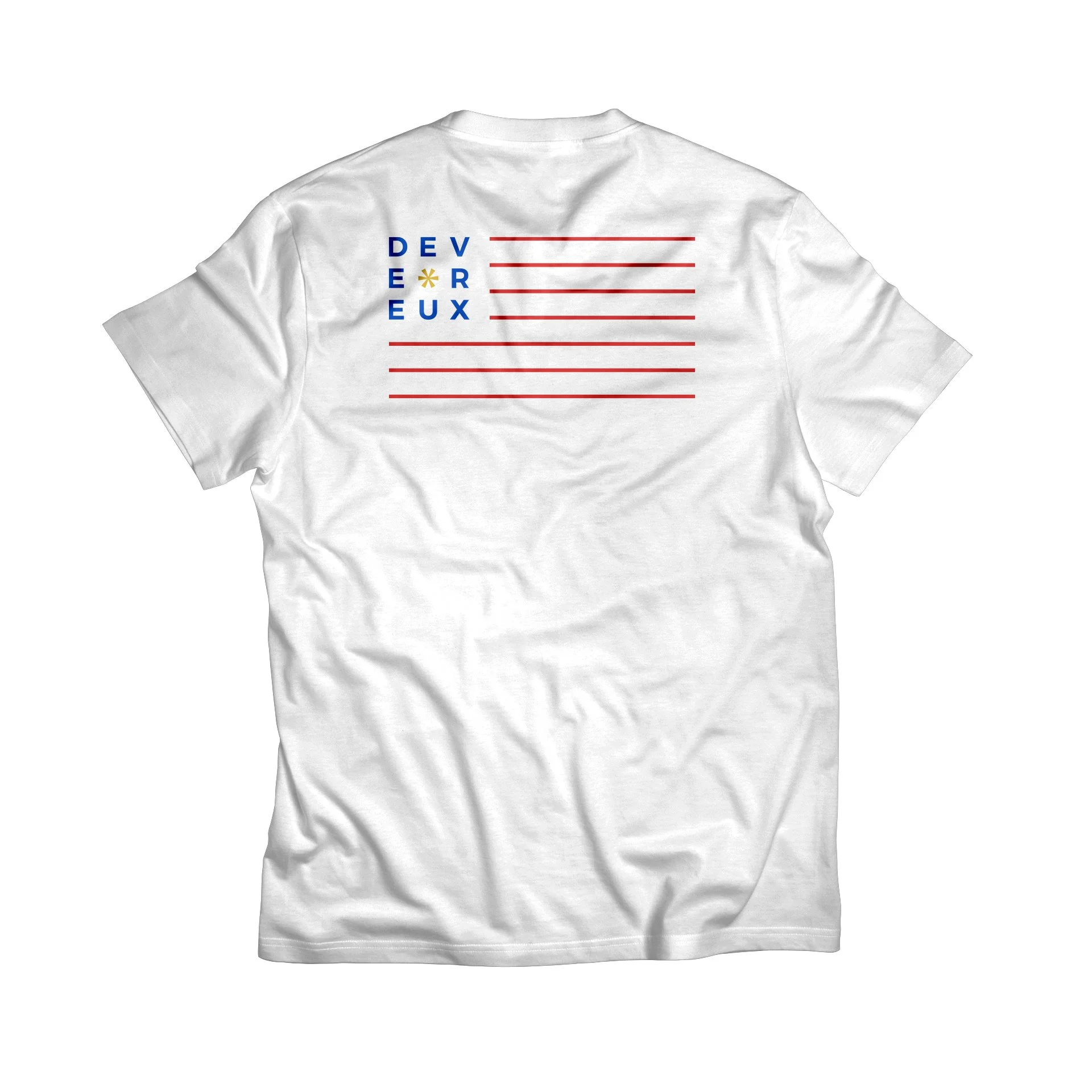
DEVEREUX GOLF
Click or drag sides of pages to navigate.
EXPOSITION
Driving the creative rebrand that helped modernize and open up the game of golf.
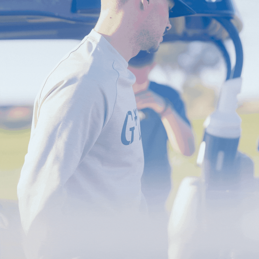
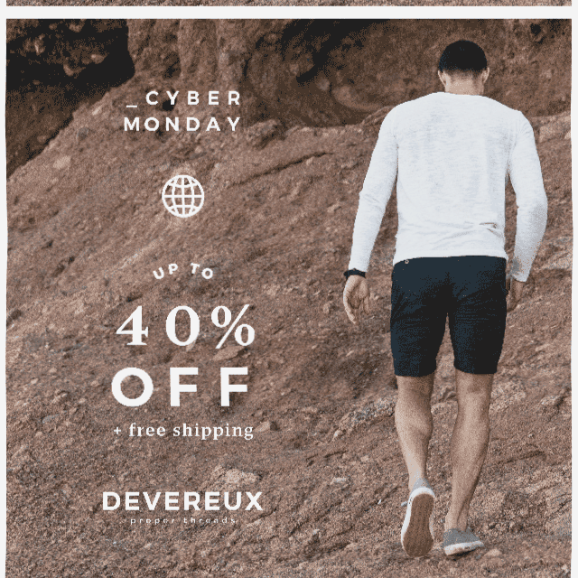
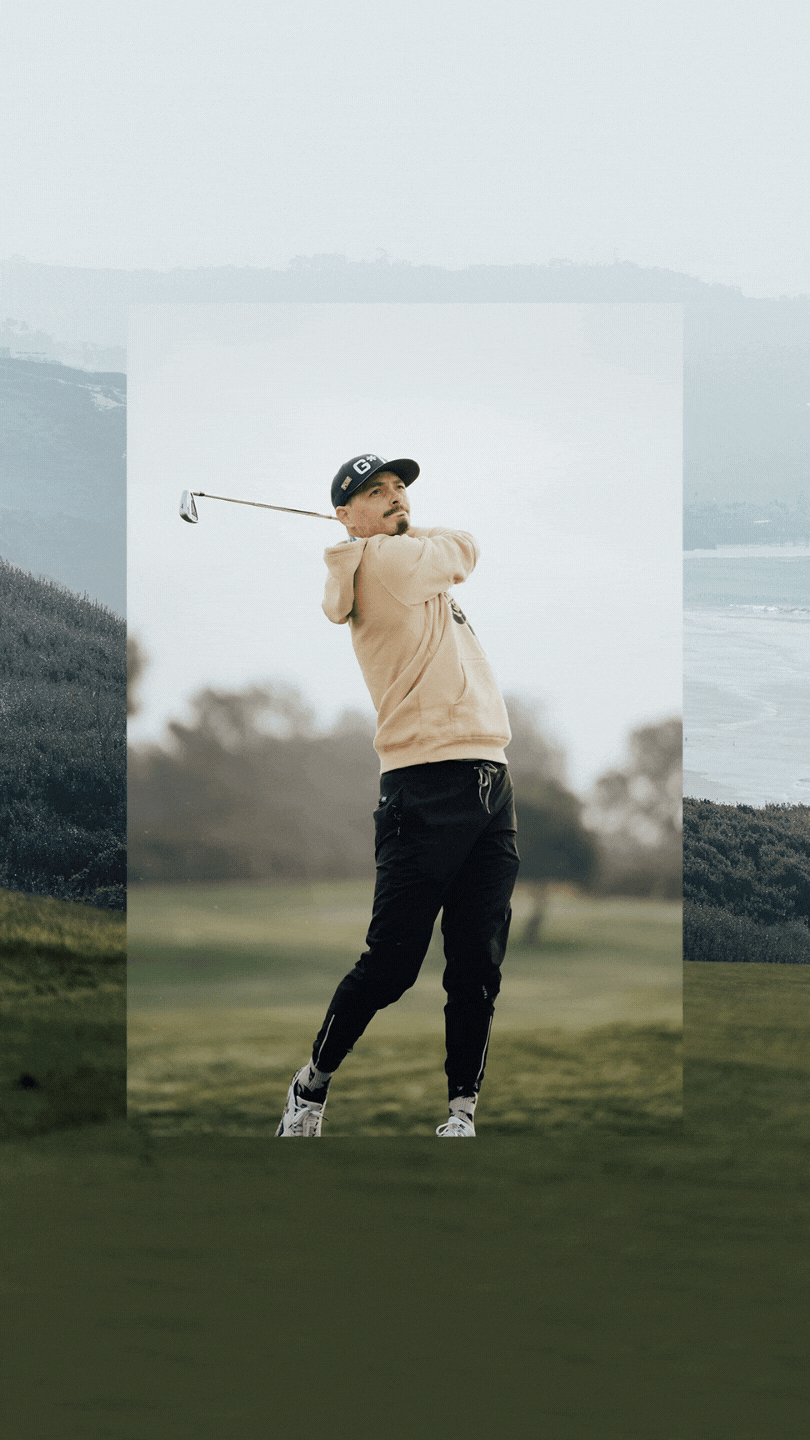
Devereux Golf is a prominent athletic apparel brand with a strong presence across 170+ golf clubs, and when I stepped into the Art Director role, the company was approaching one of its most defining transitions. The industry was shifting, COVID-19 was reshaping how brands connected with their audiences, and golf itself felt ready for a new era—one that was more accessible, more expressive, and far less bound by tradition. I was responsible for leading the creative transformation through this pivot, spearheading a full rebrand in 2021 and shaping how that vision lived across every part of the business.
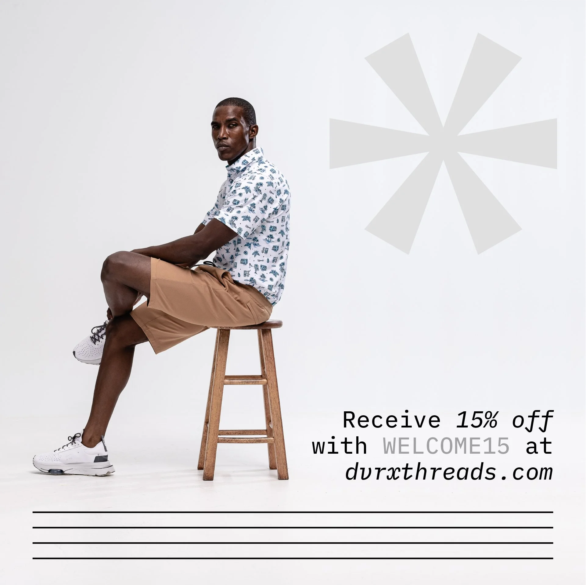
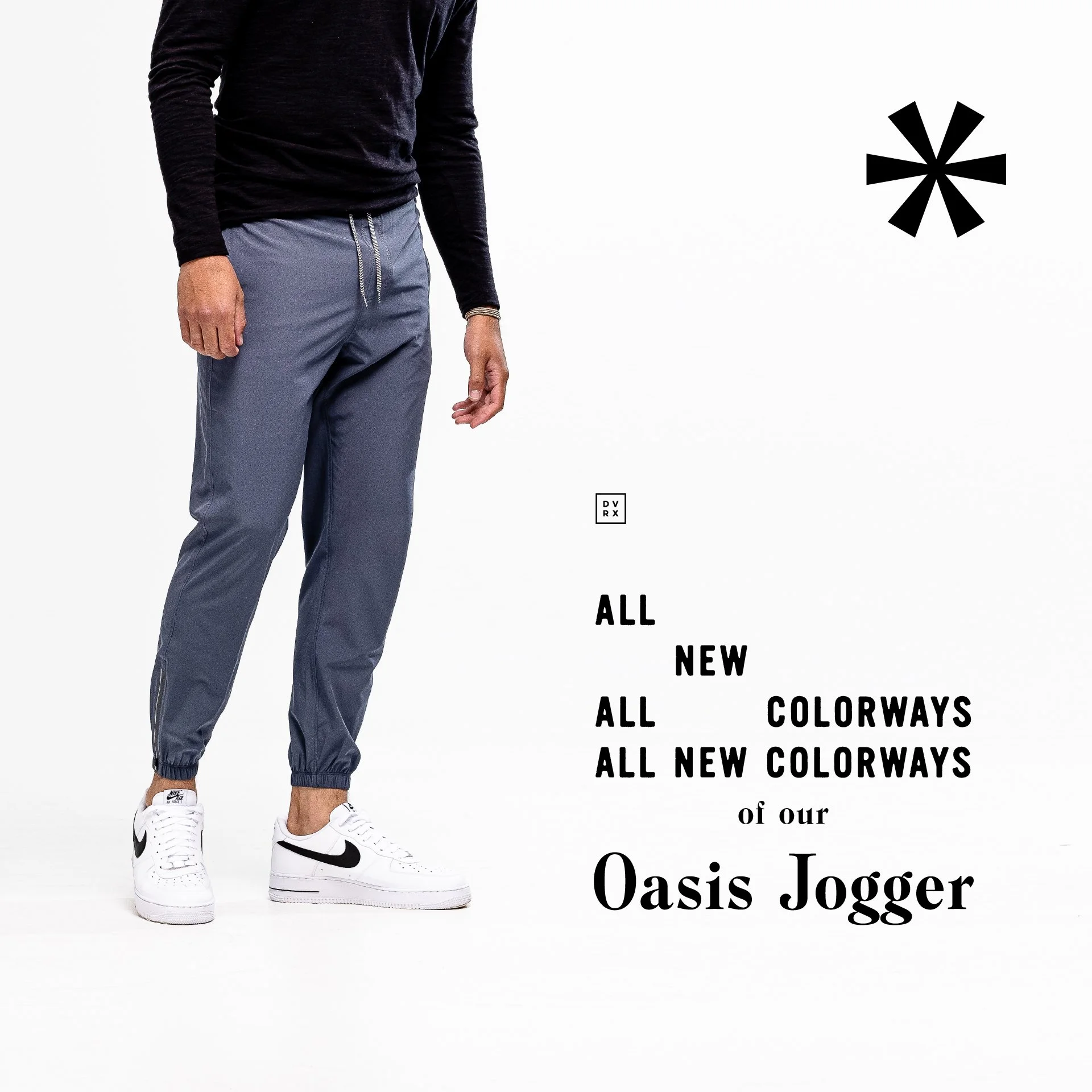
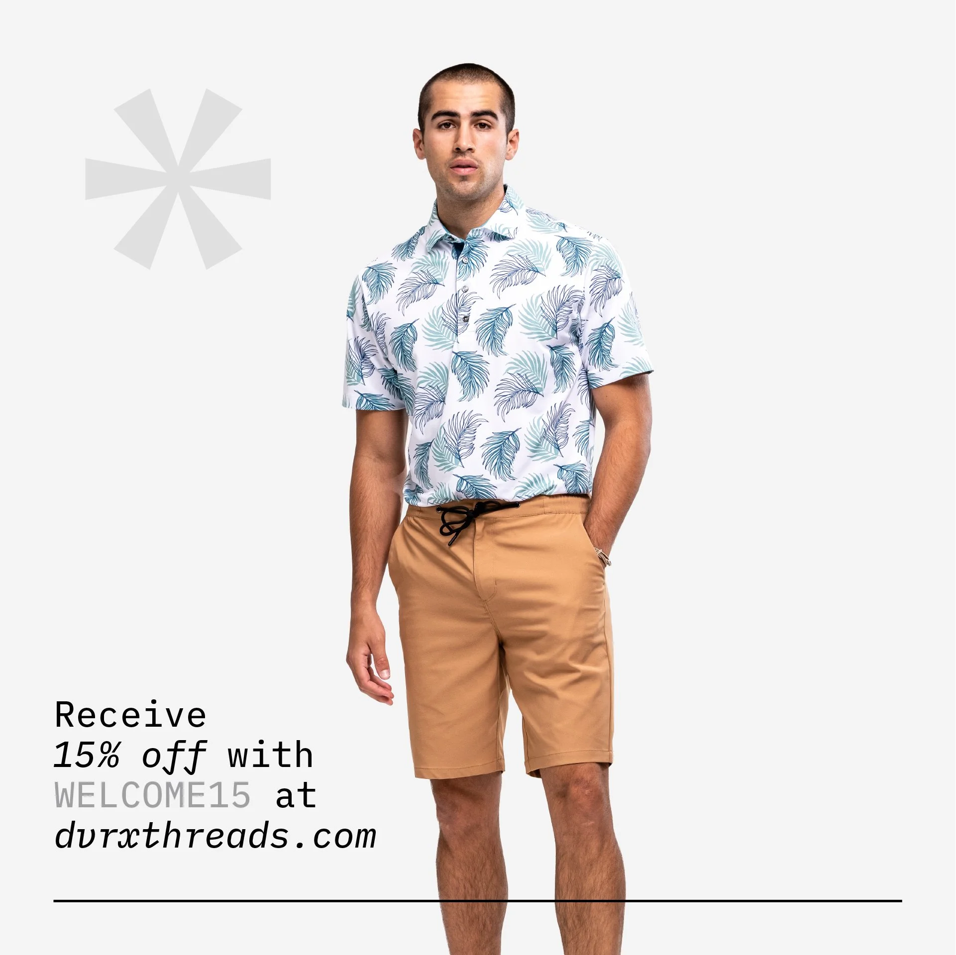
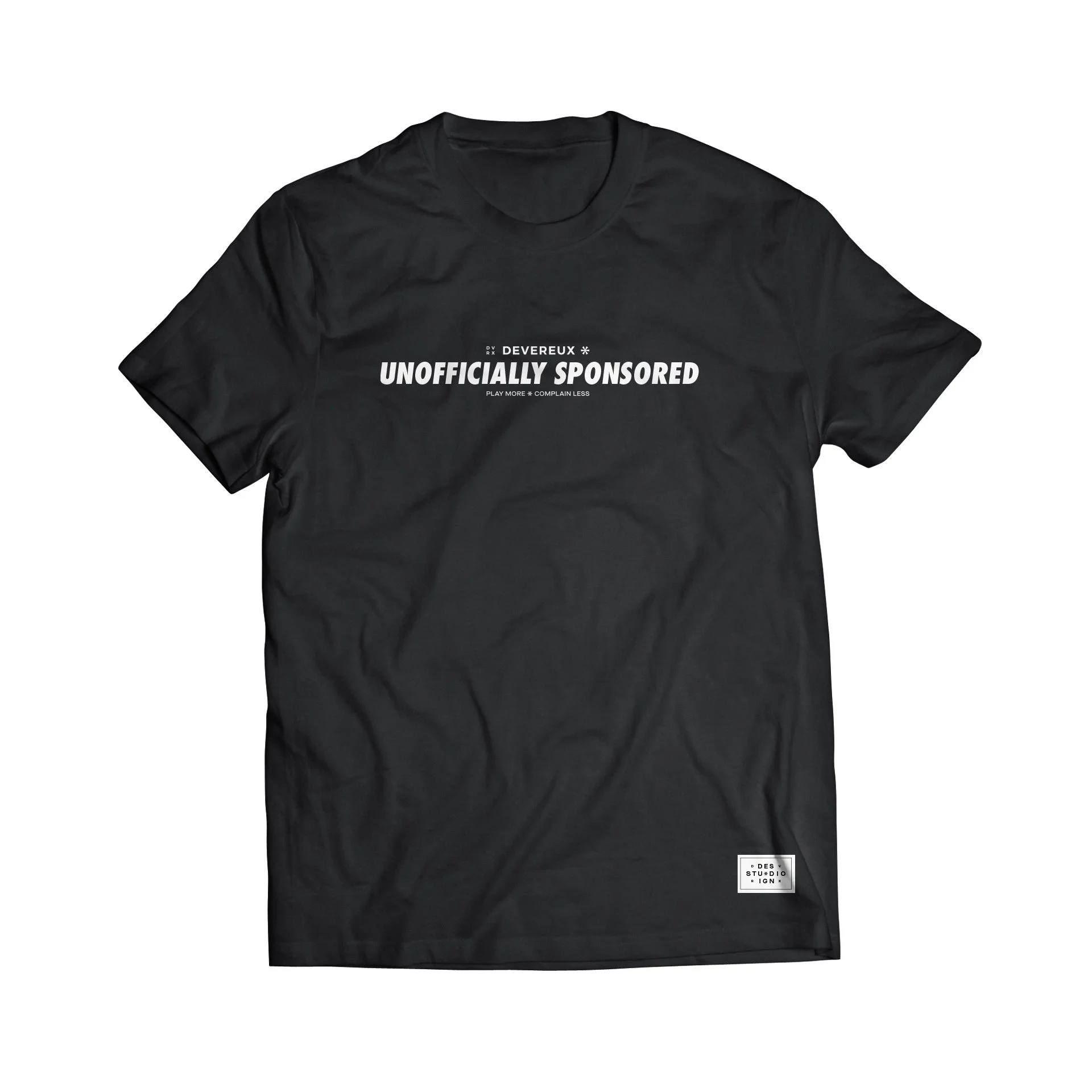
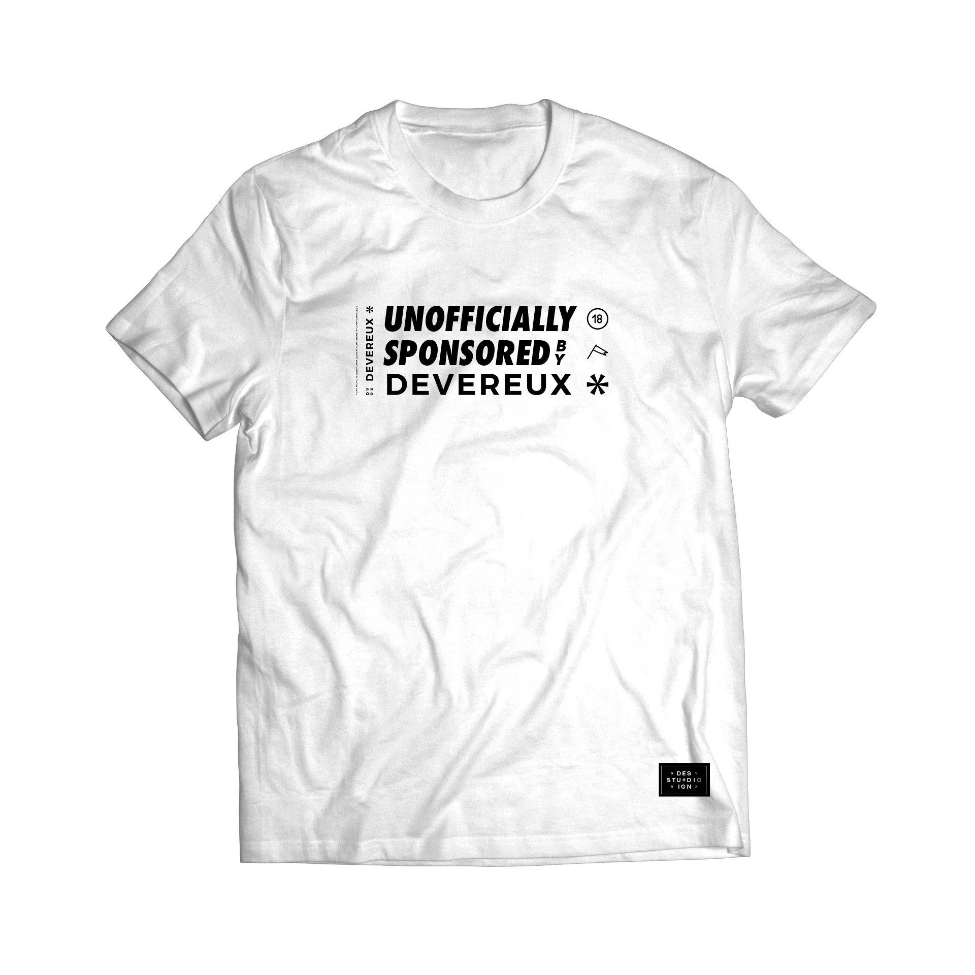
My work spanned the full arc of the brand—before the rebrand, through the transition, and well into its implementation. From visual identity and product development to digital storytelling, PR alignment, packaging, illustration, and campaign creative, I helped guide Devereux toward a more culturally relevant and inclusive position in the golf world. The goal was simple and ambitious: design a brand we were proud of, create products we genuinely wanted to wear, and invite more people into the game with a modern, welcoming point of view.
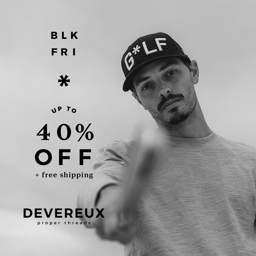
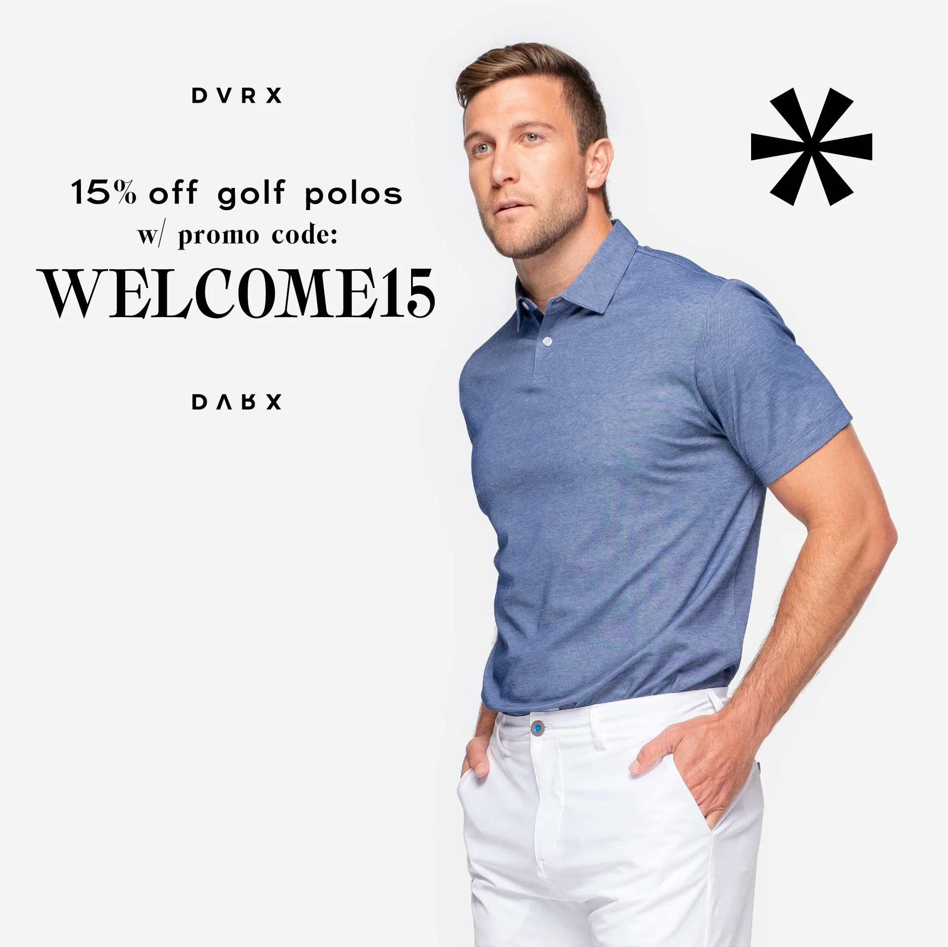
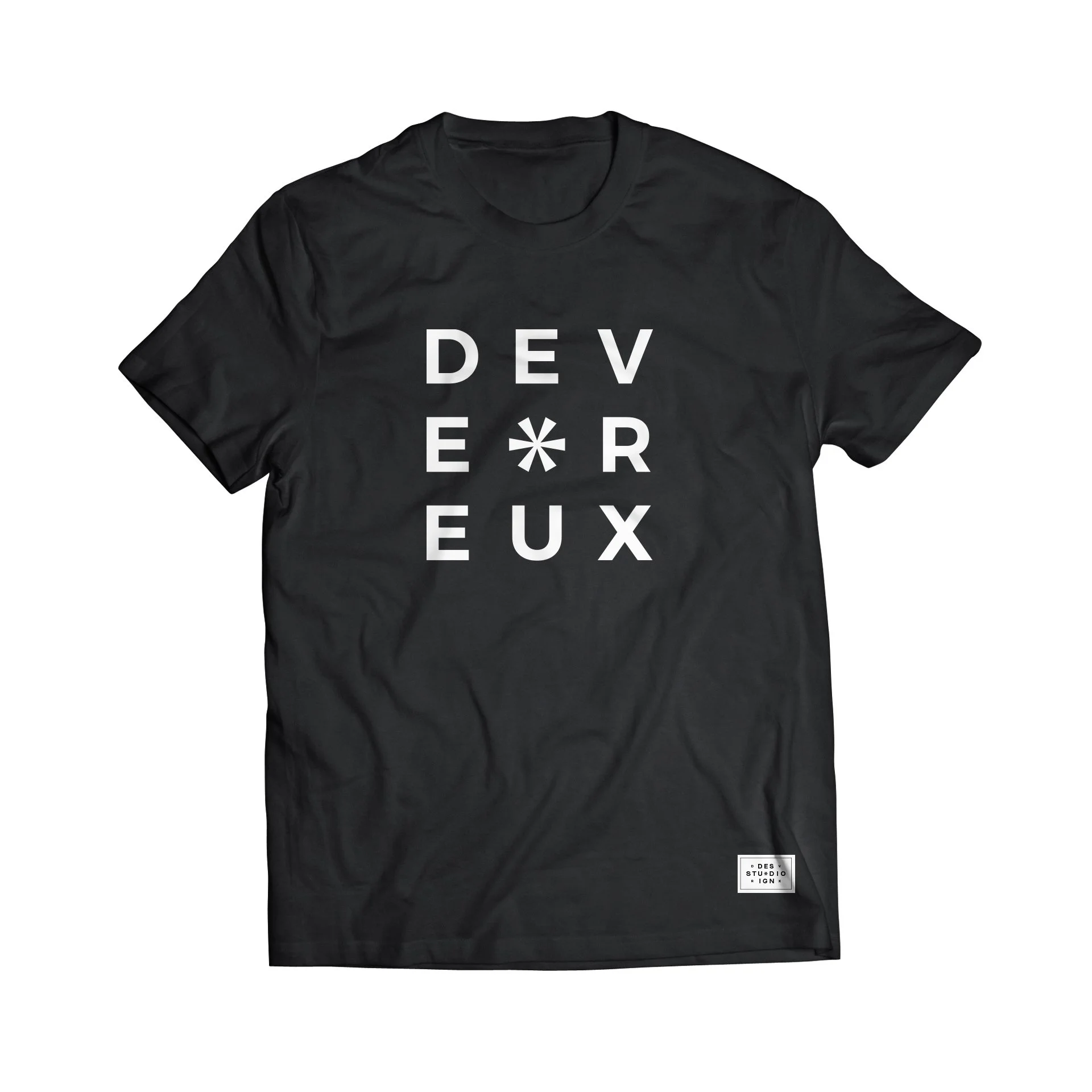
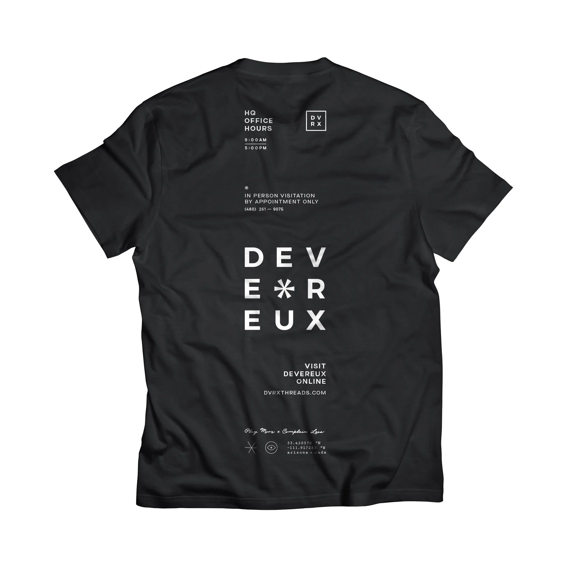
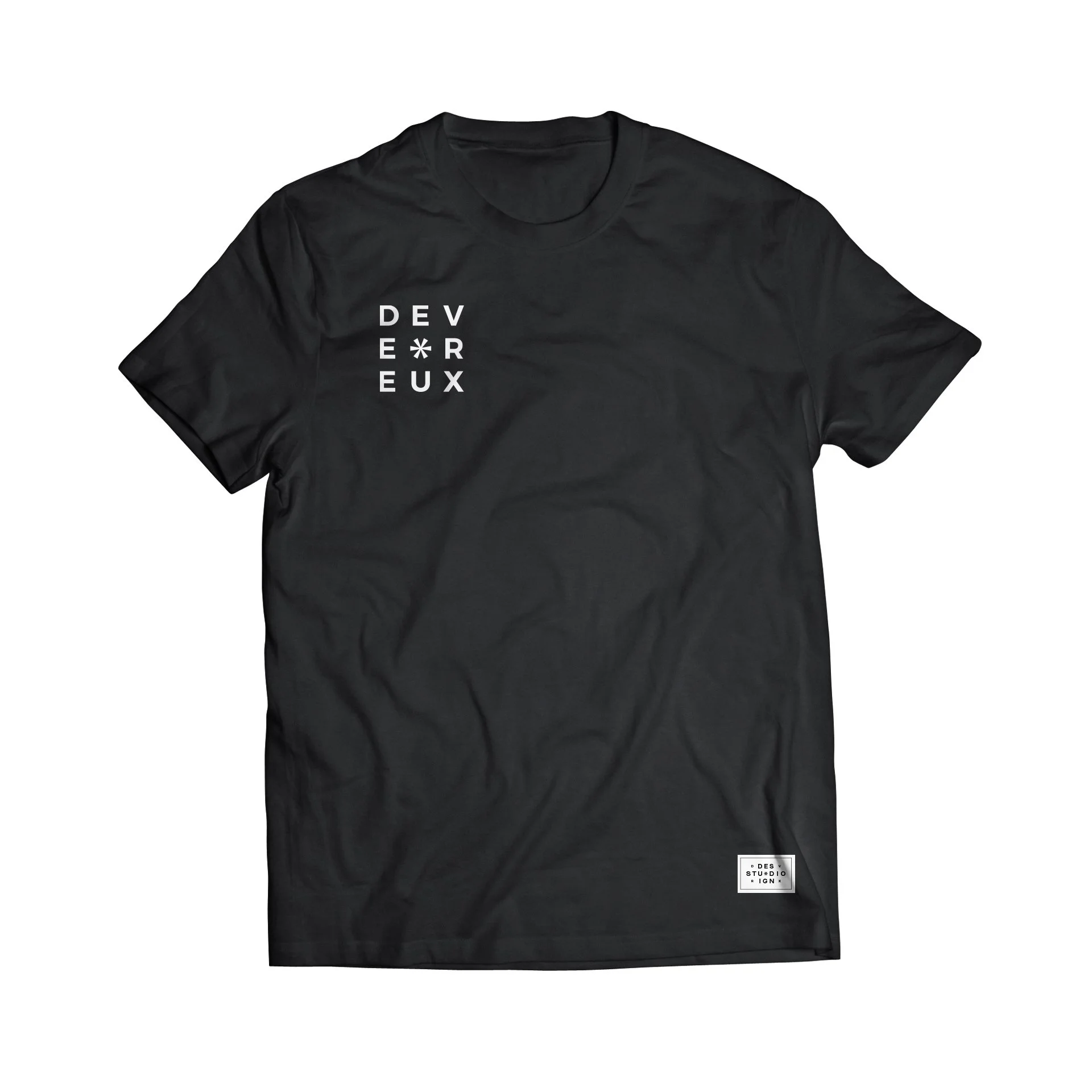
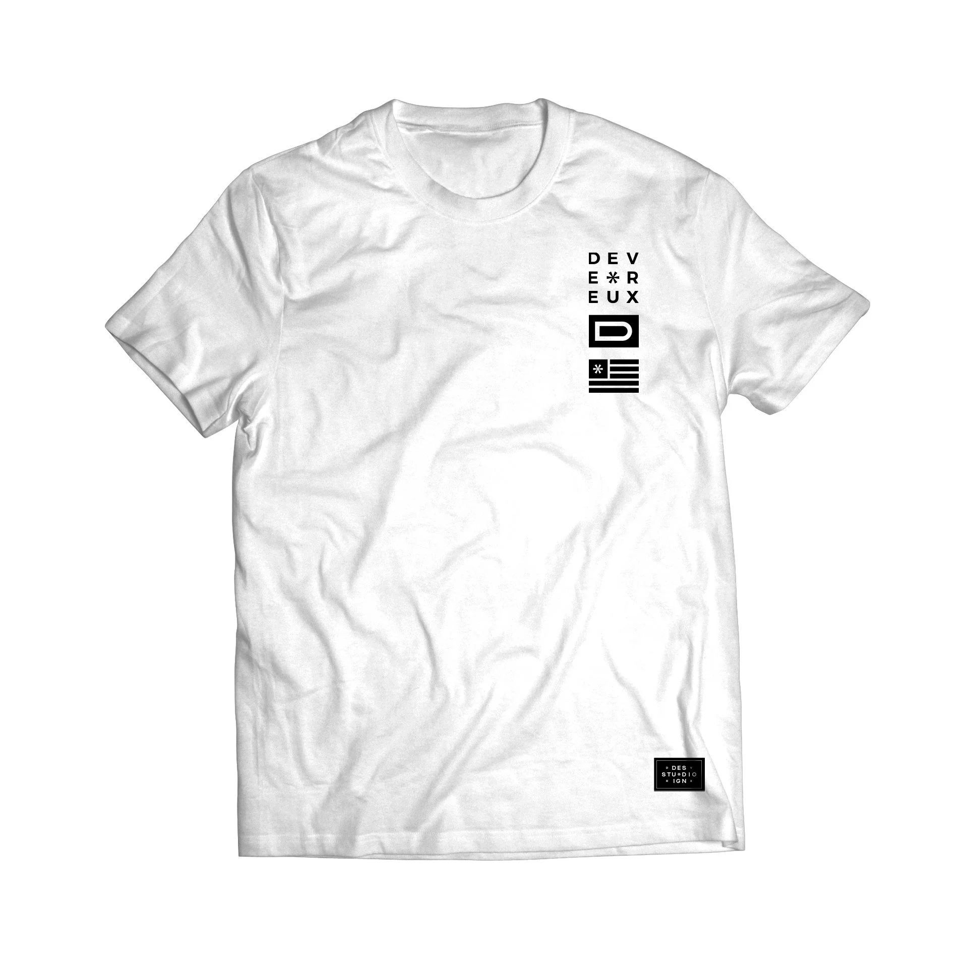
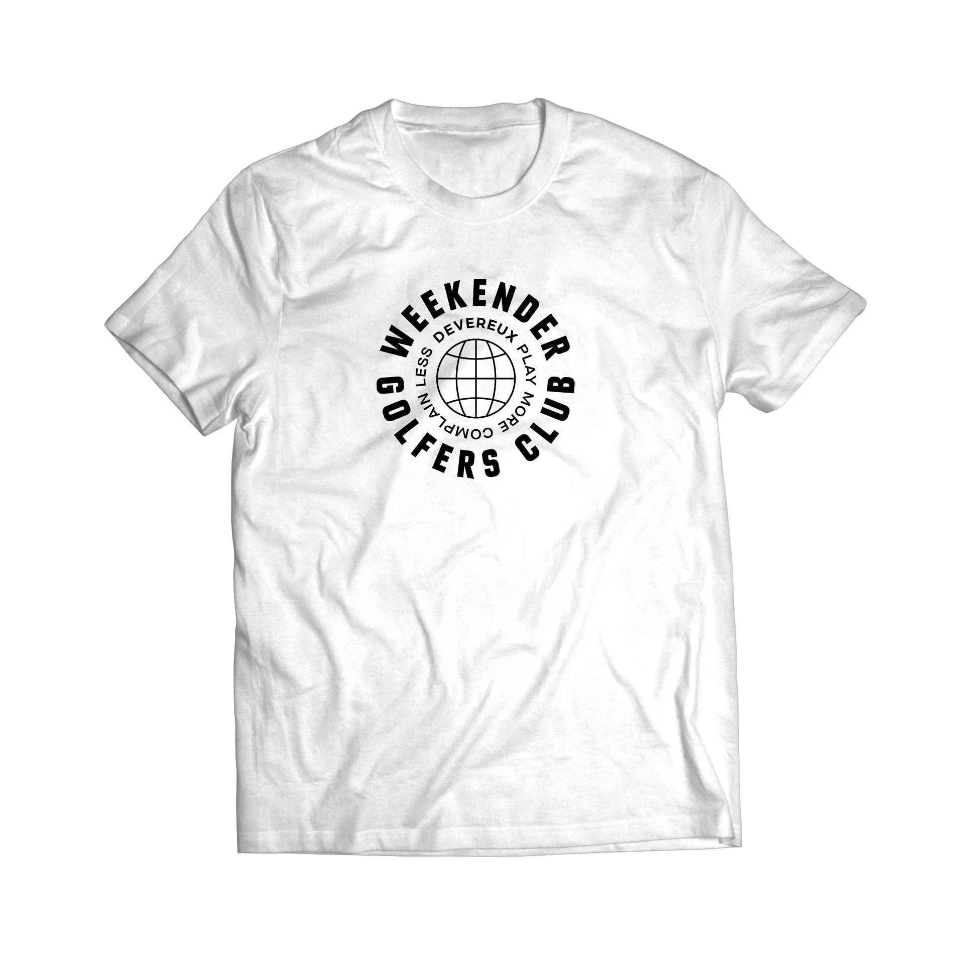
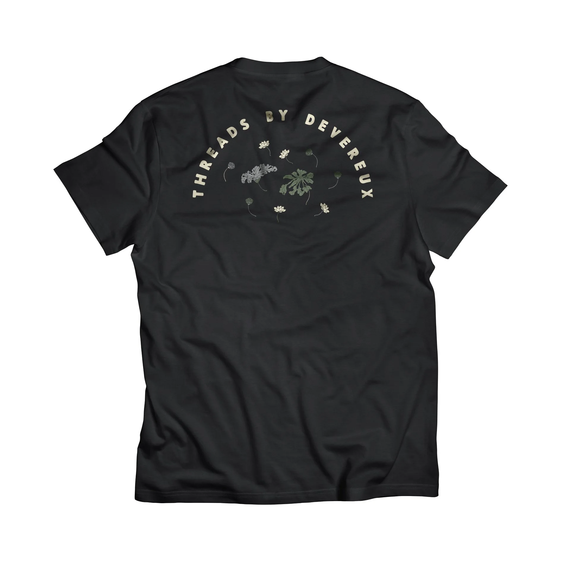
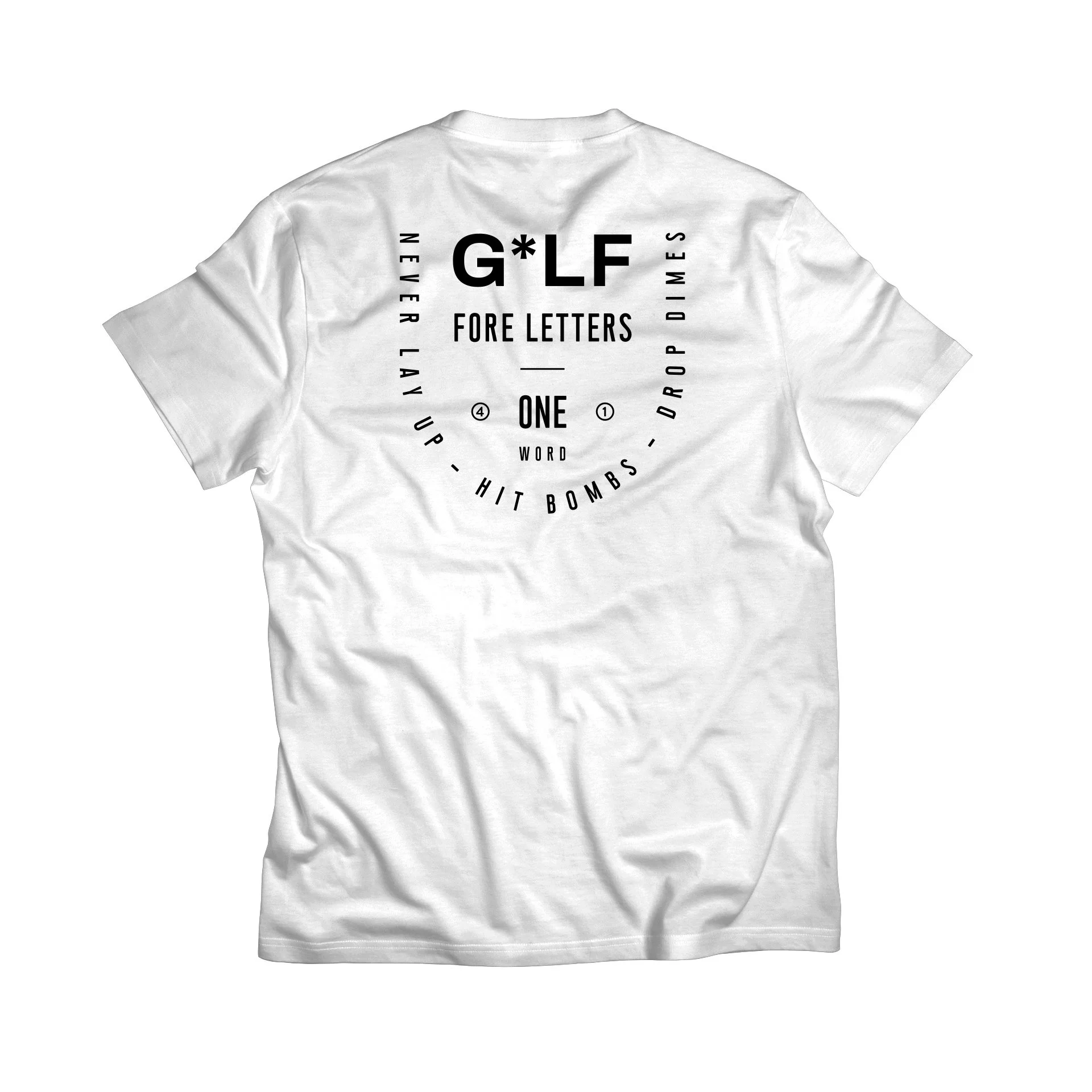
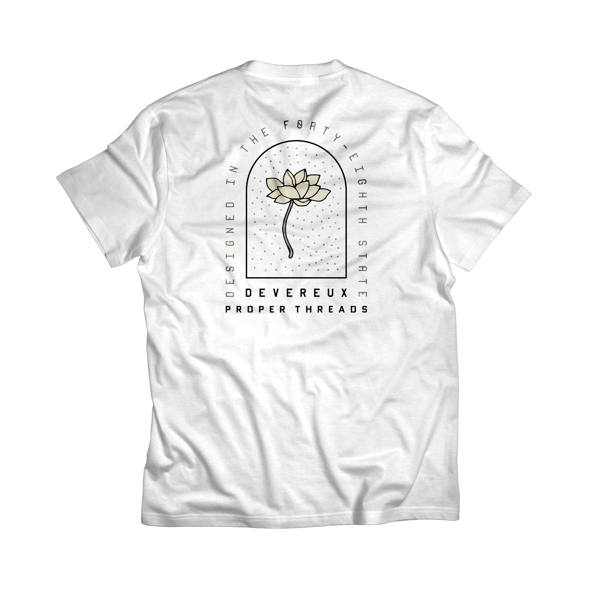
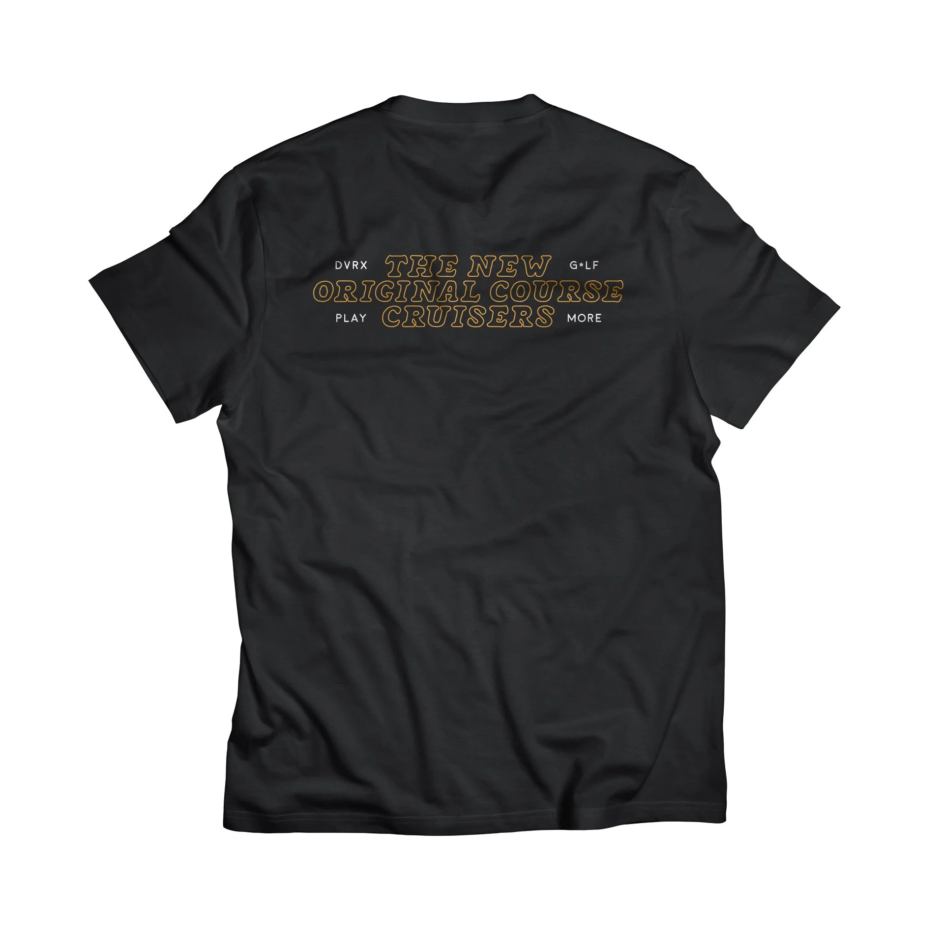
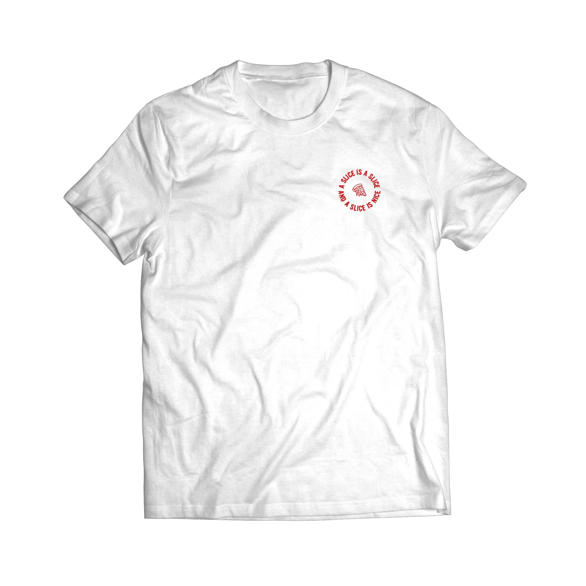
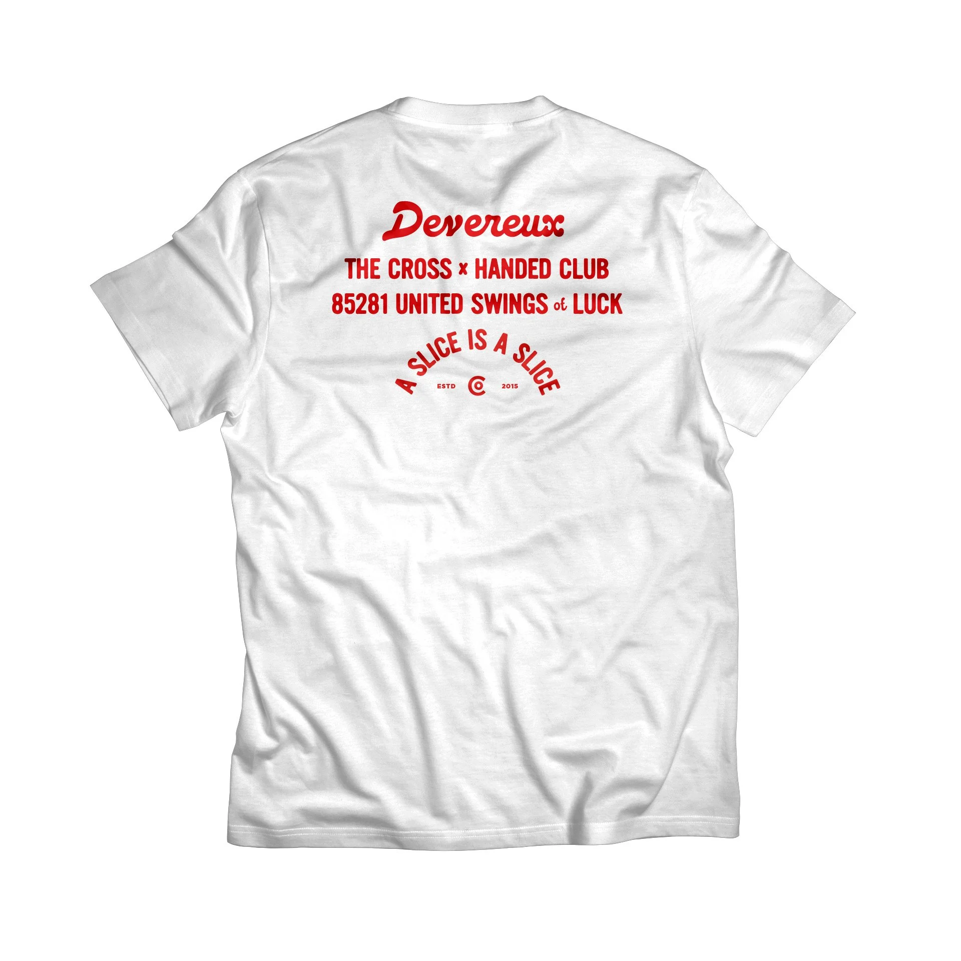
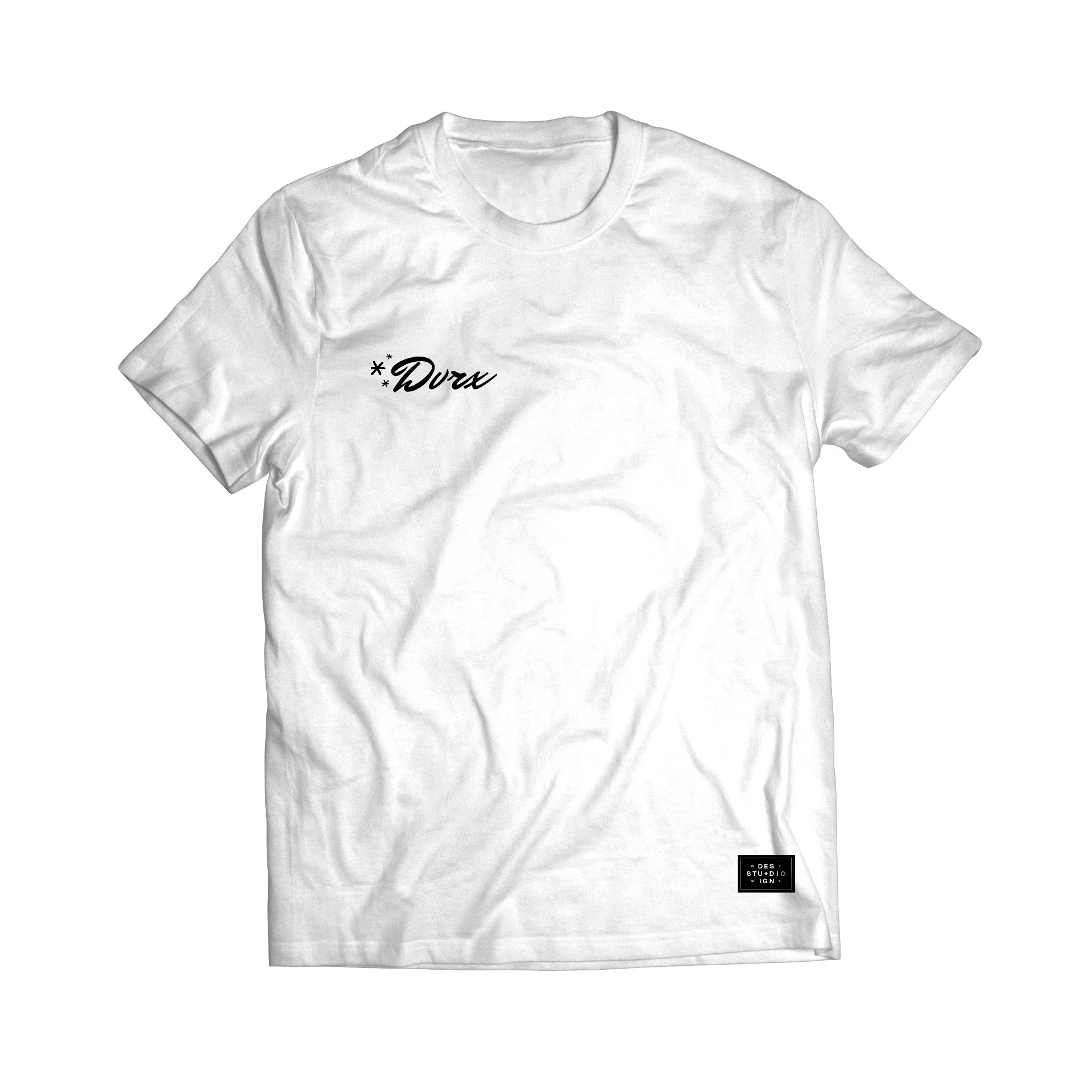
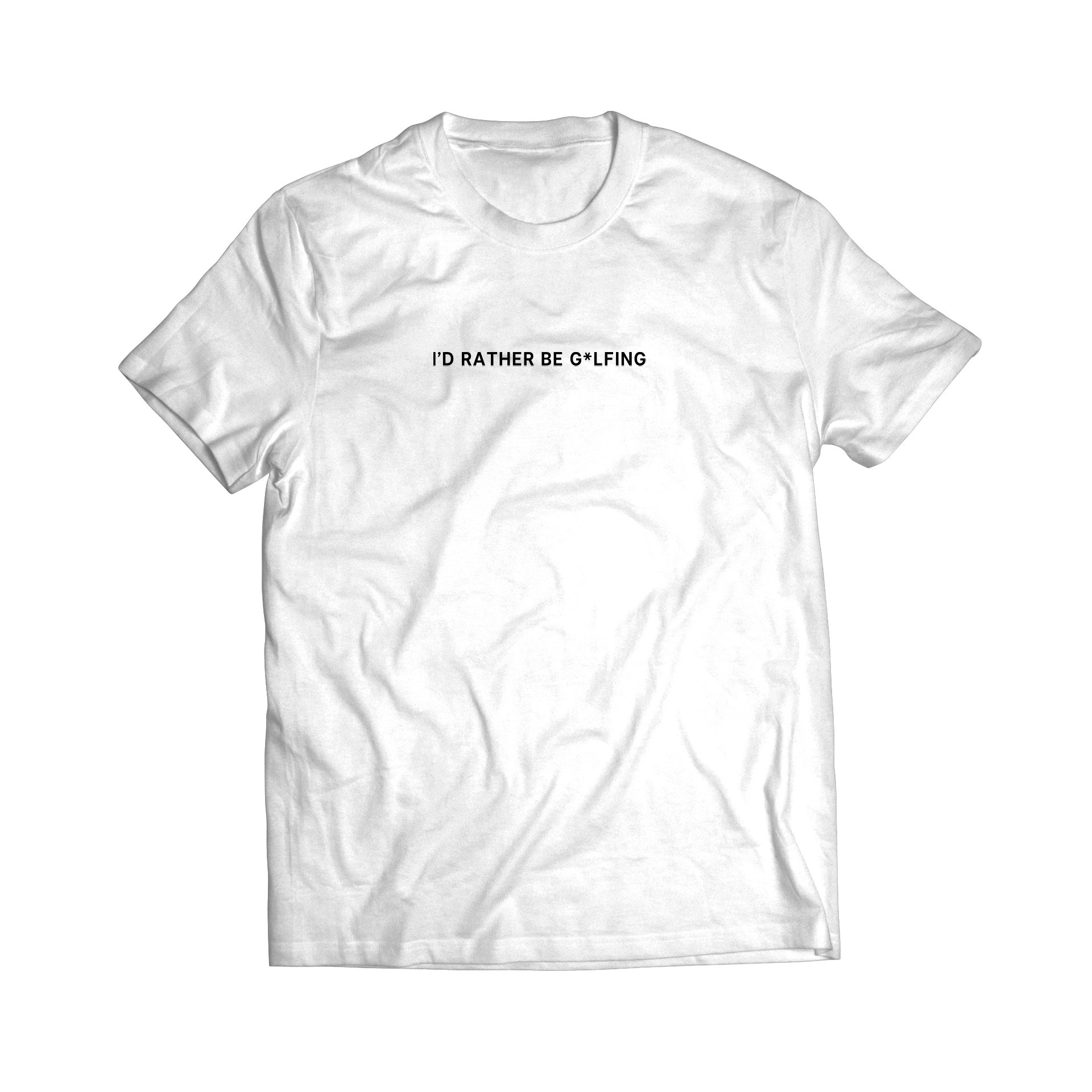
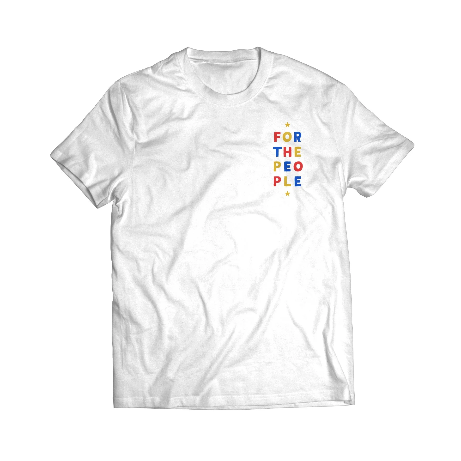
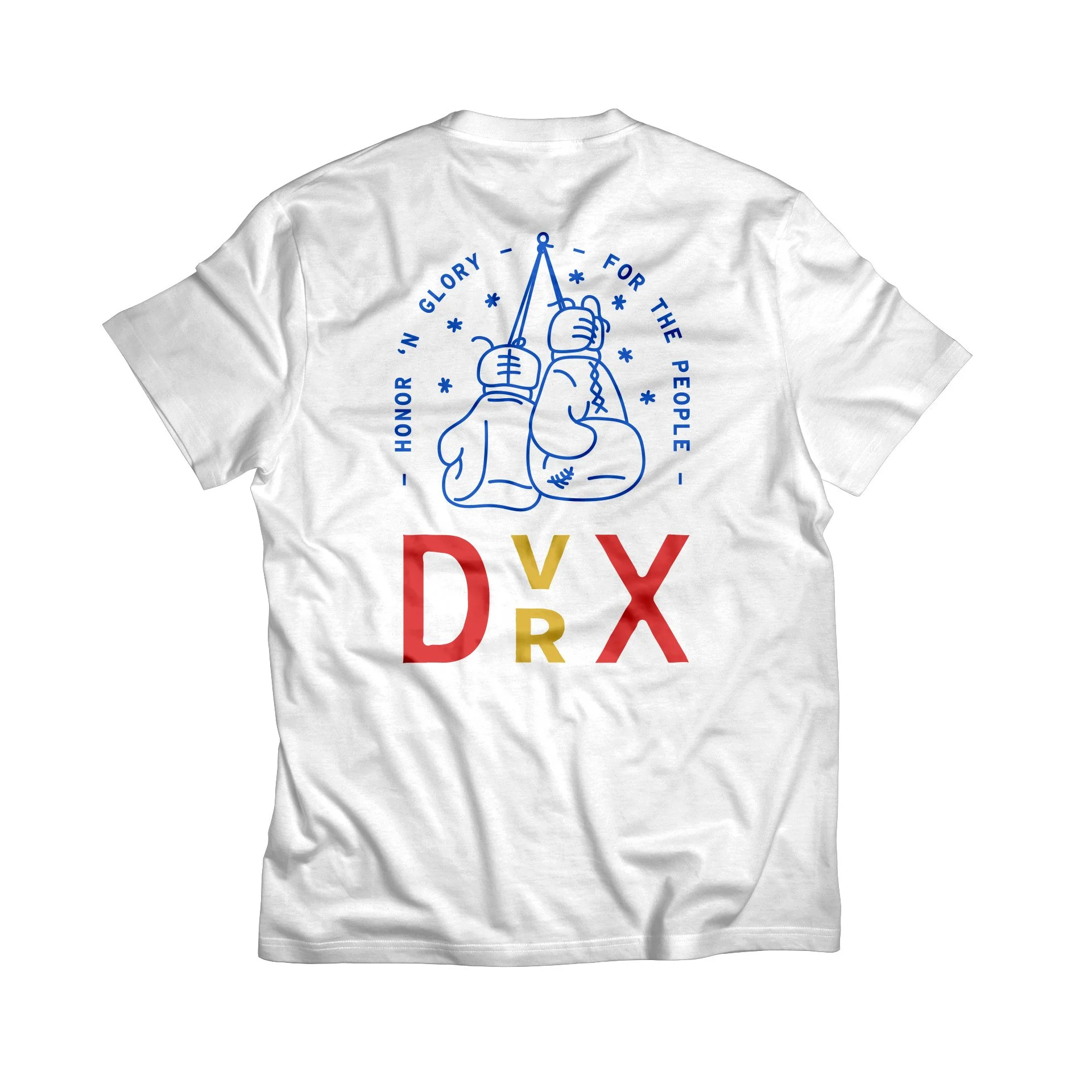
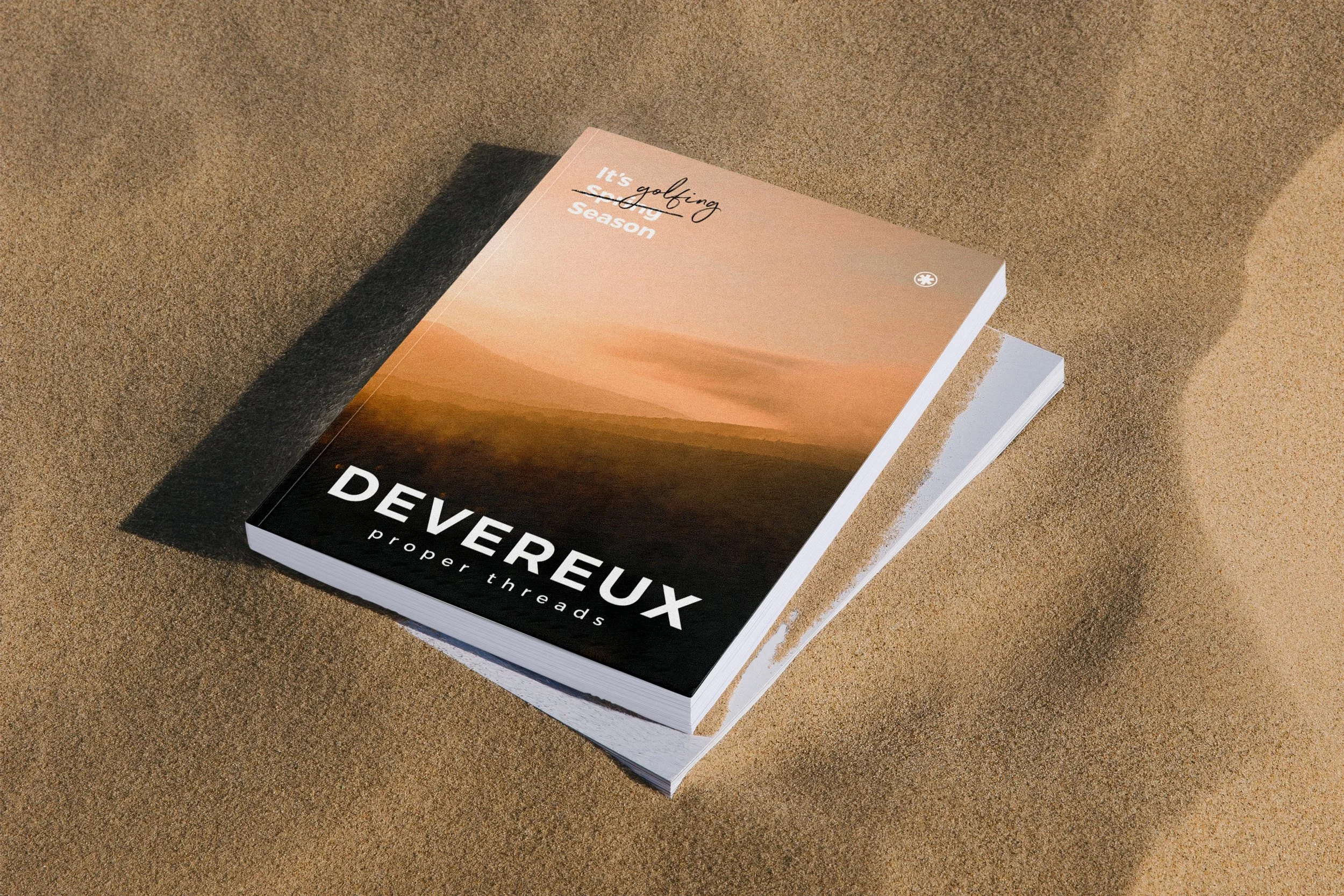
Updated logotype with new brand tagline.
Design service branding for golf-specific customization needs within partnerships.
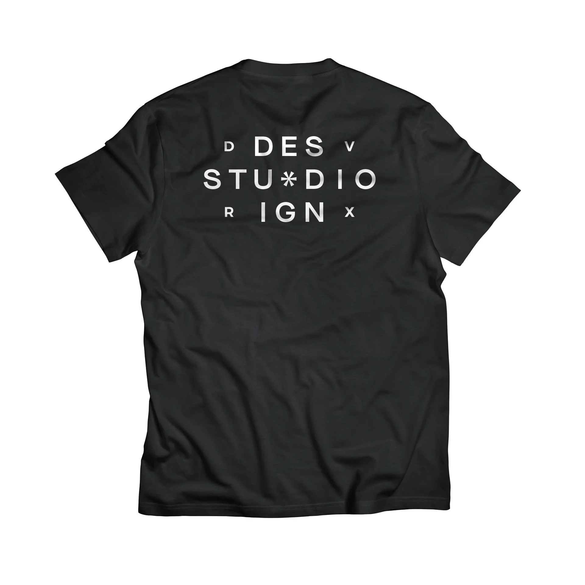
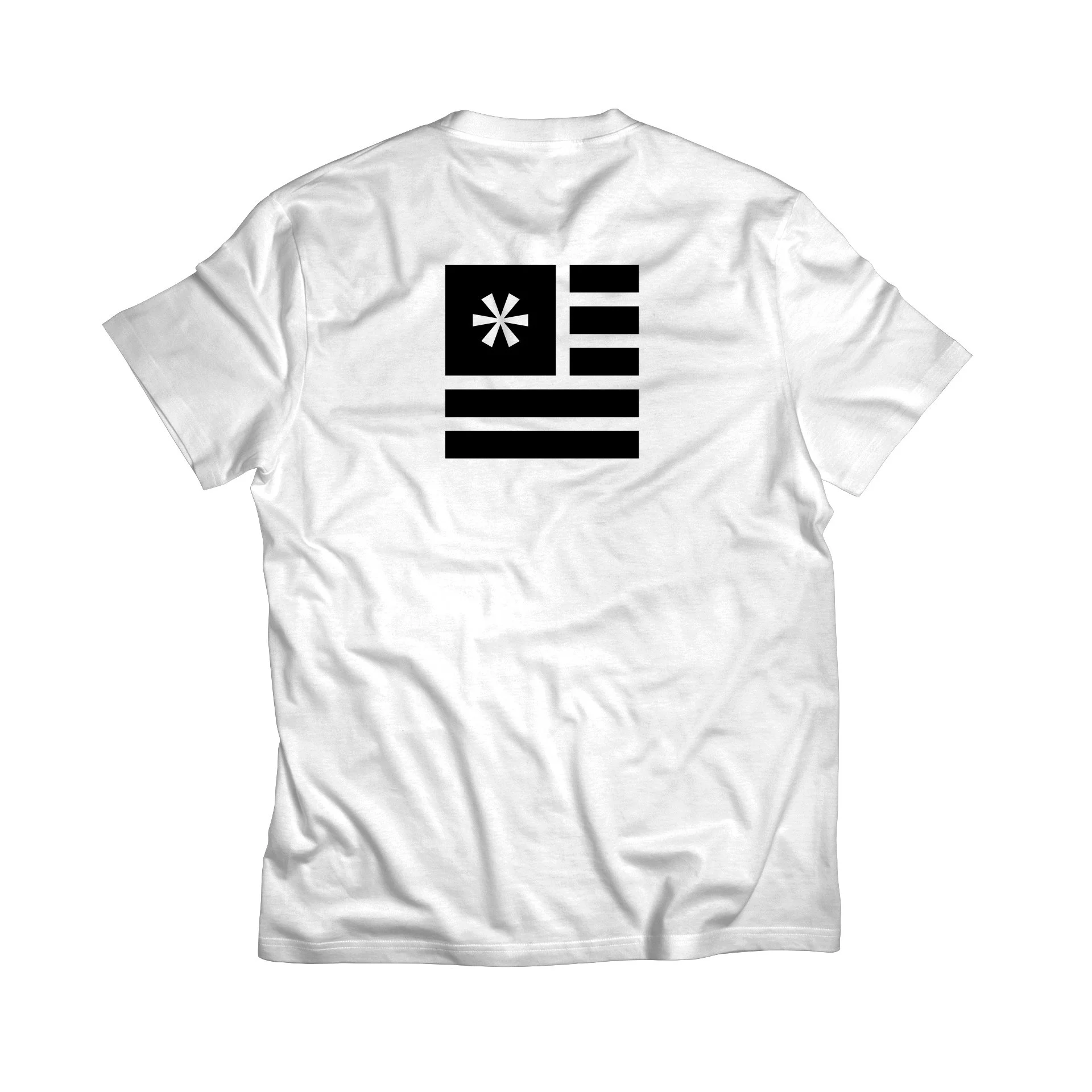
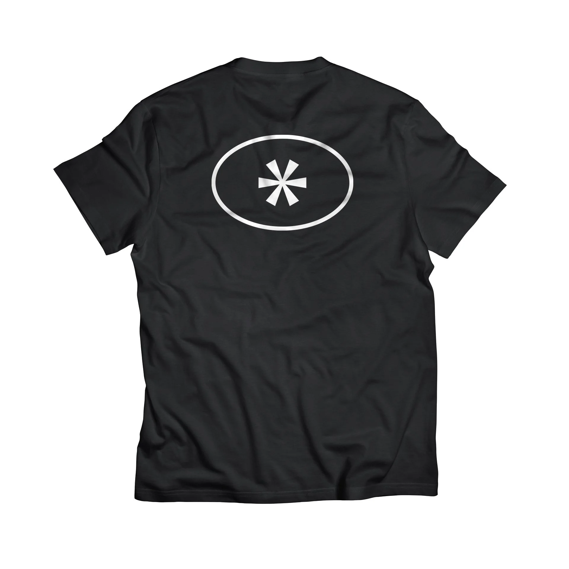
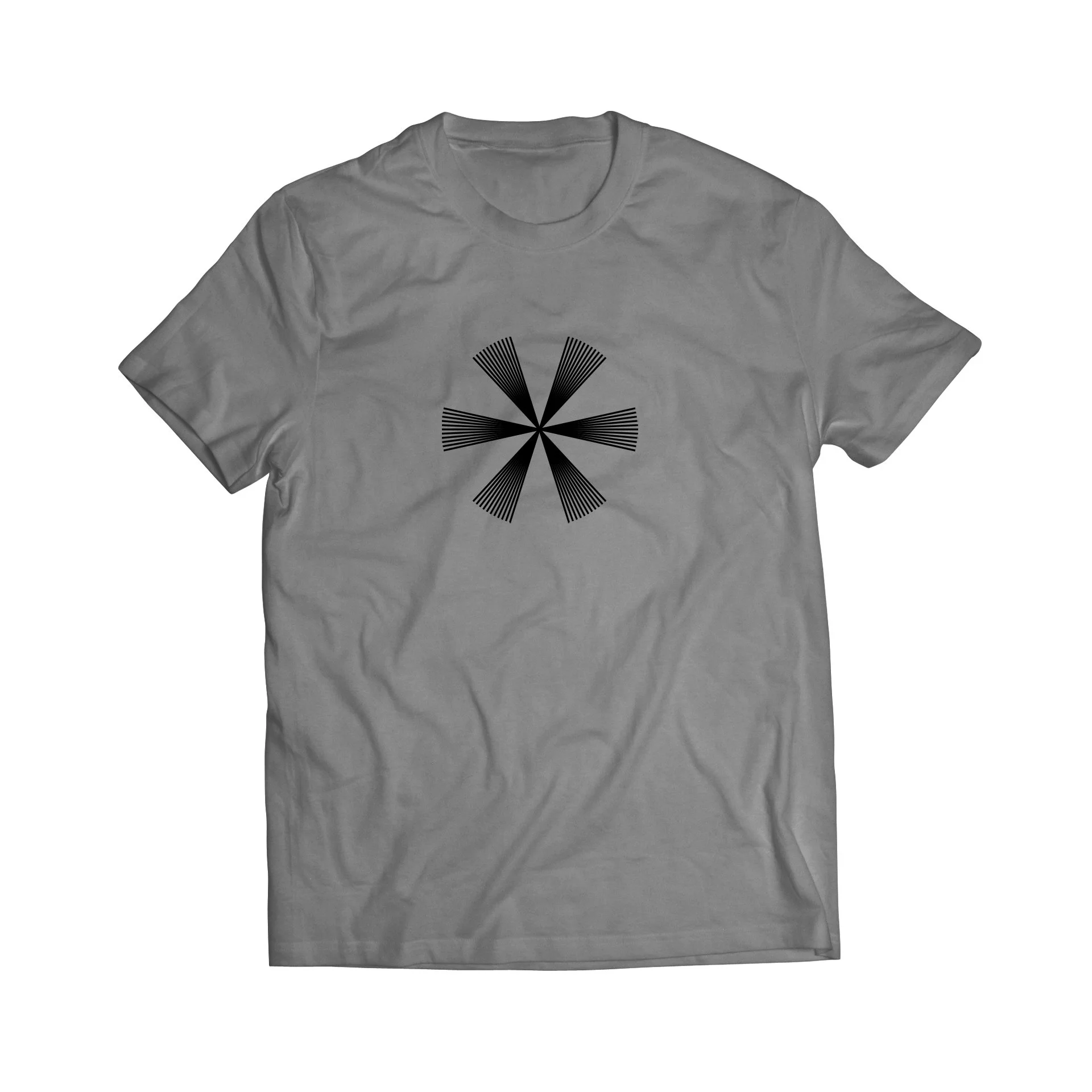
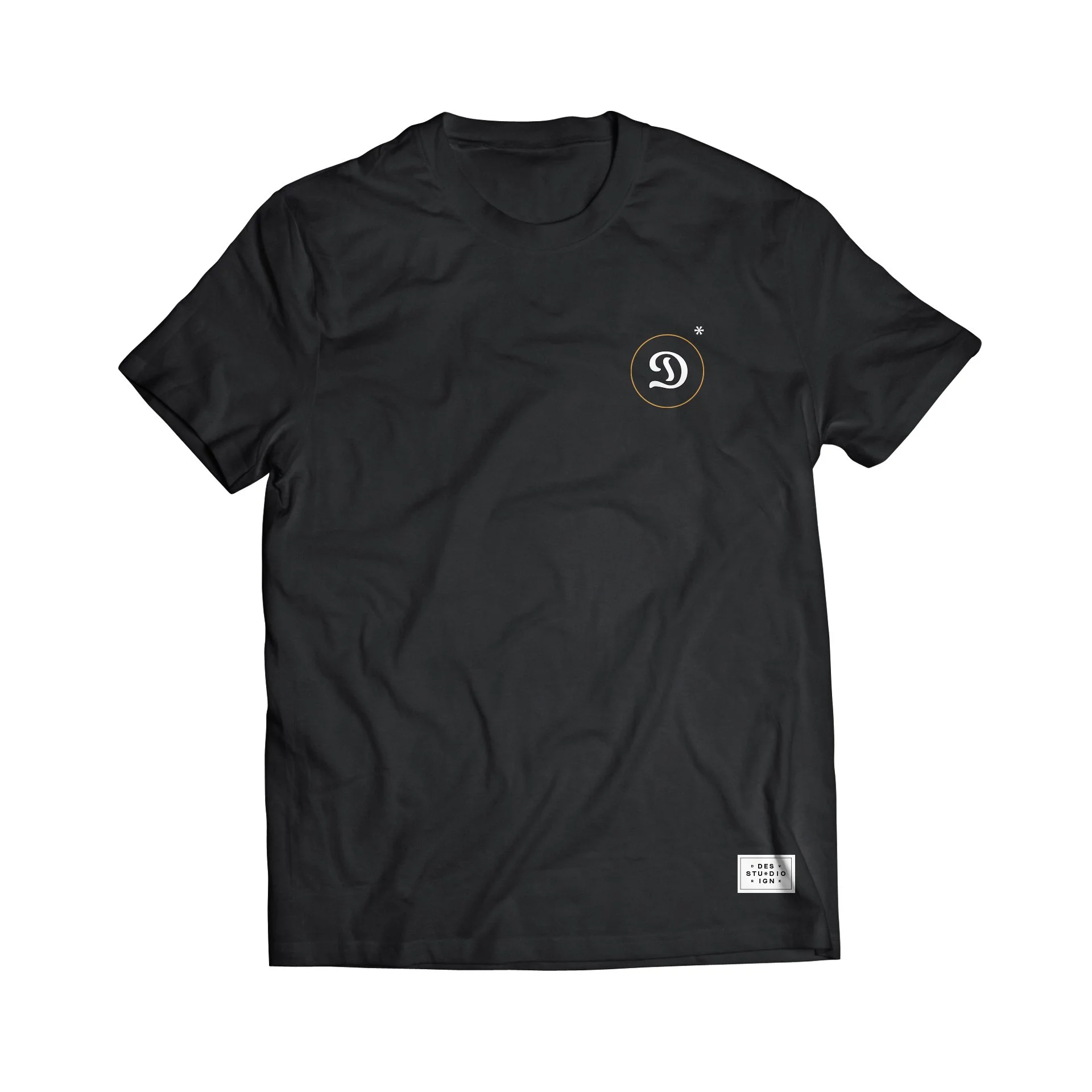
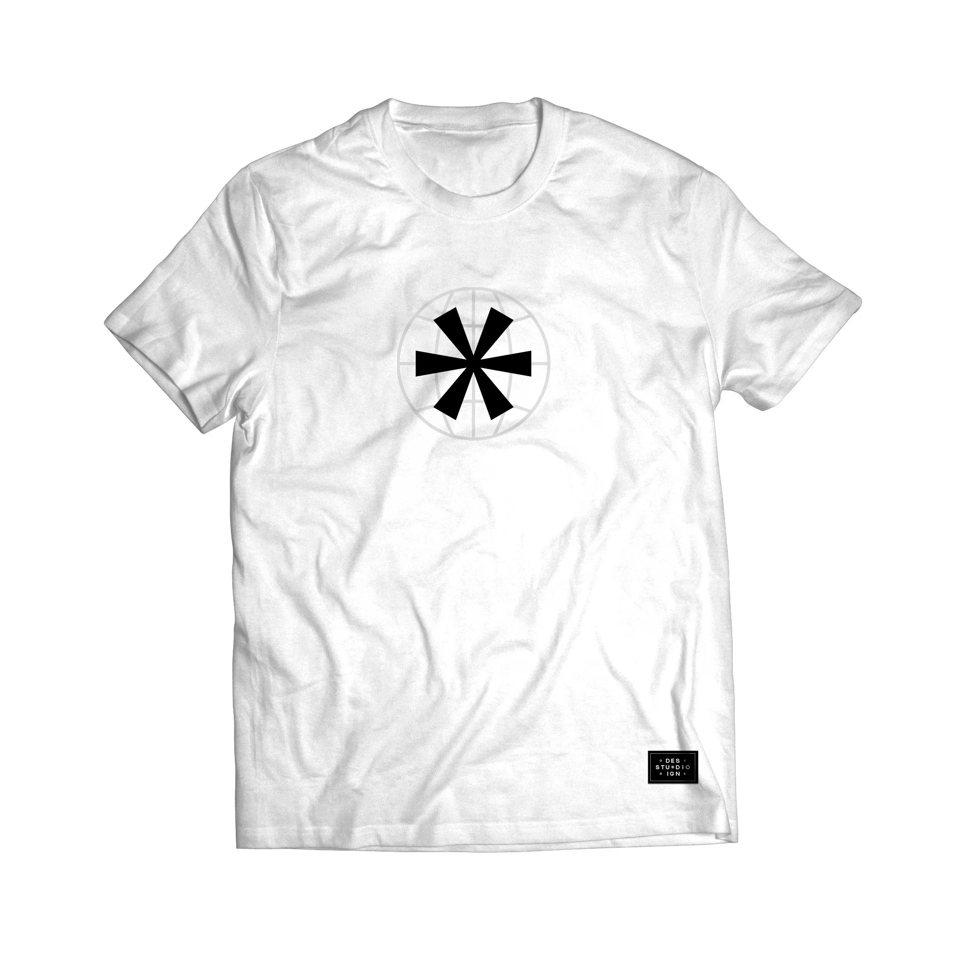
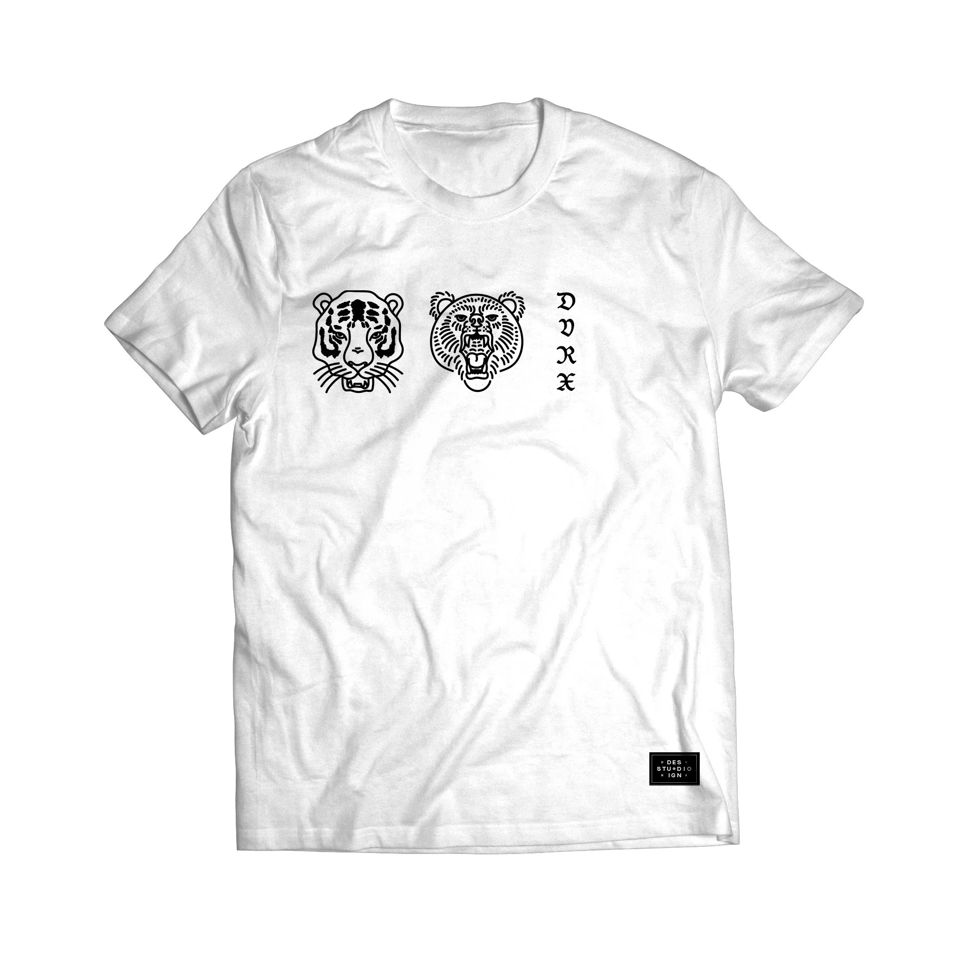
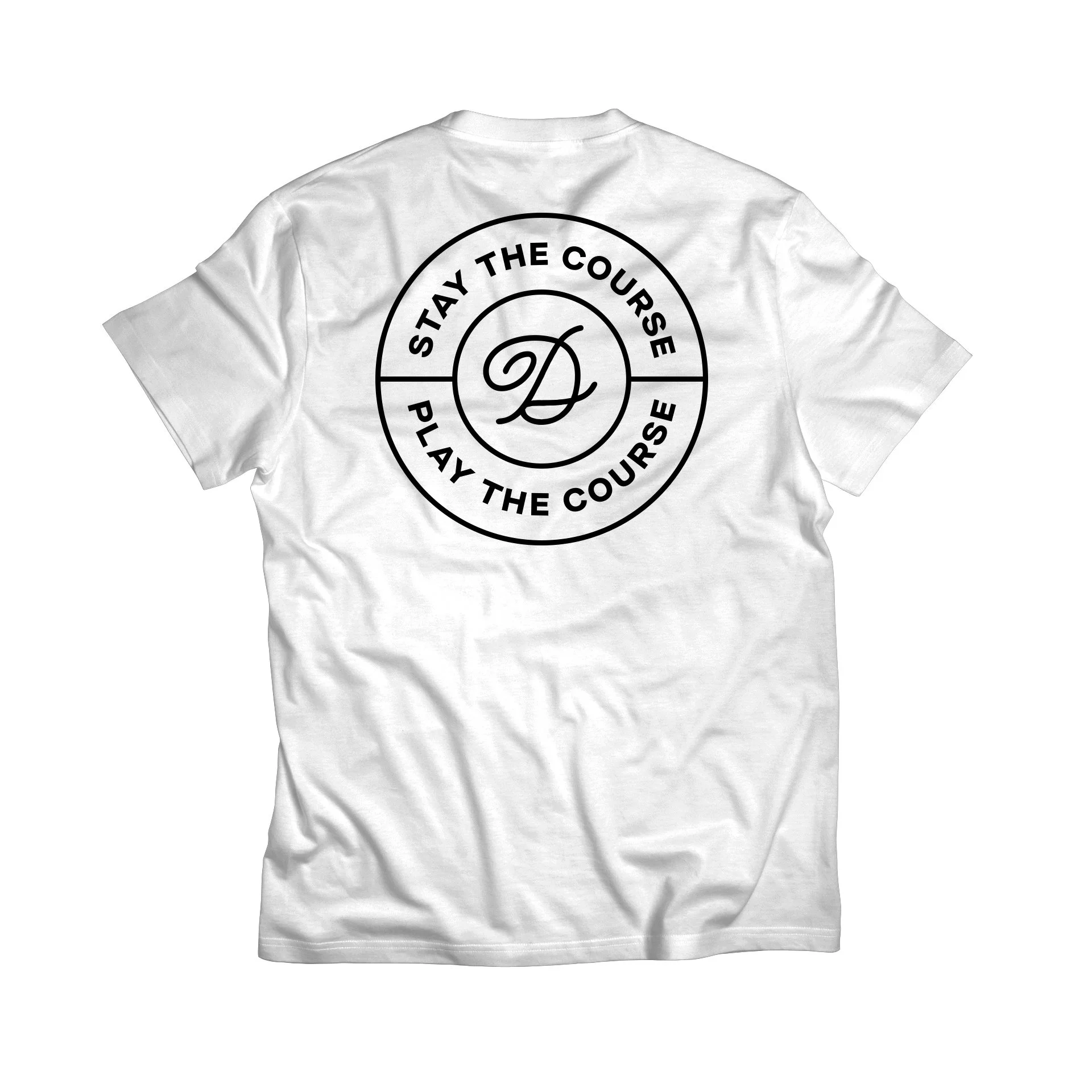
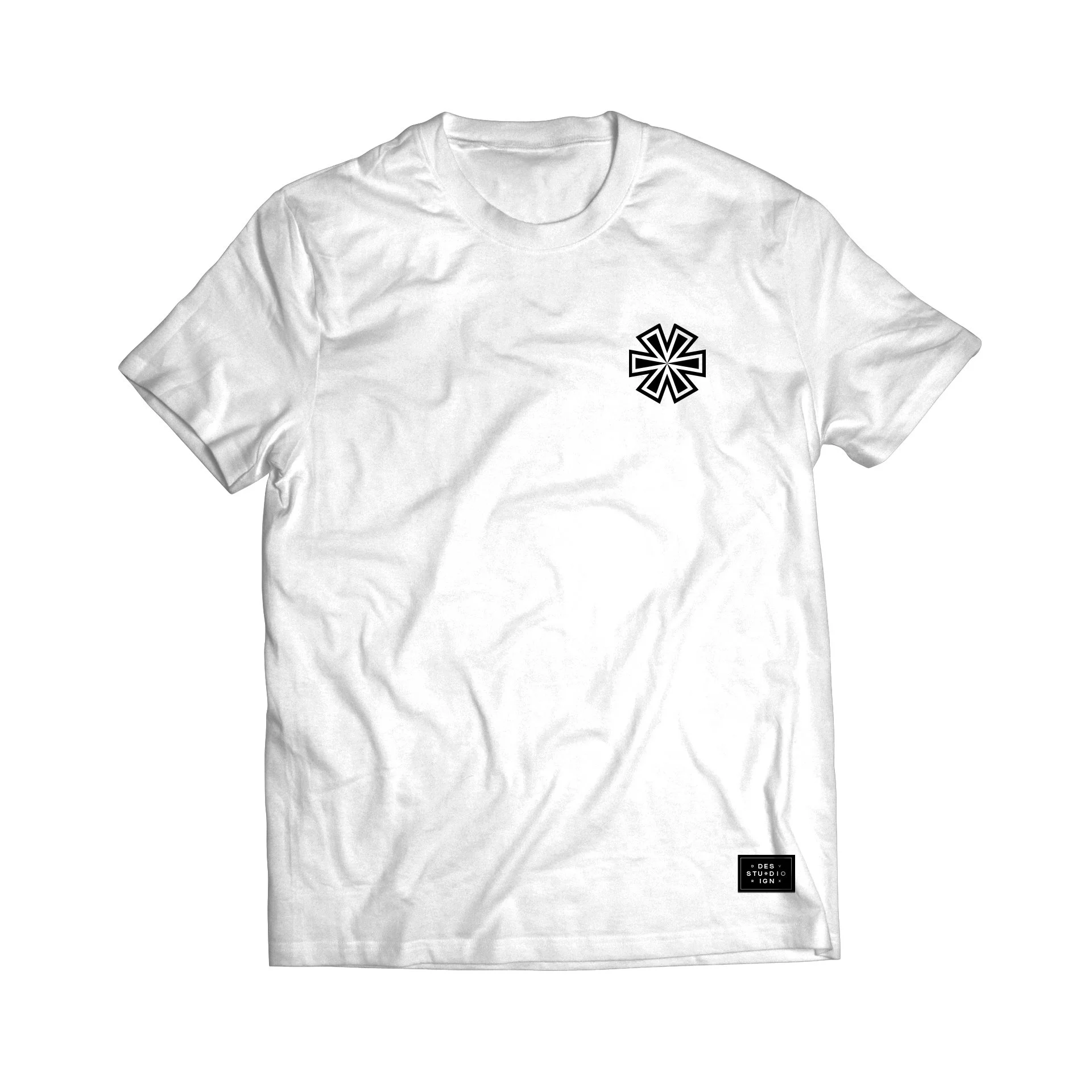
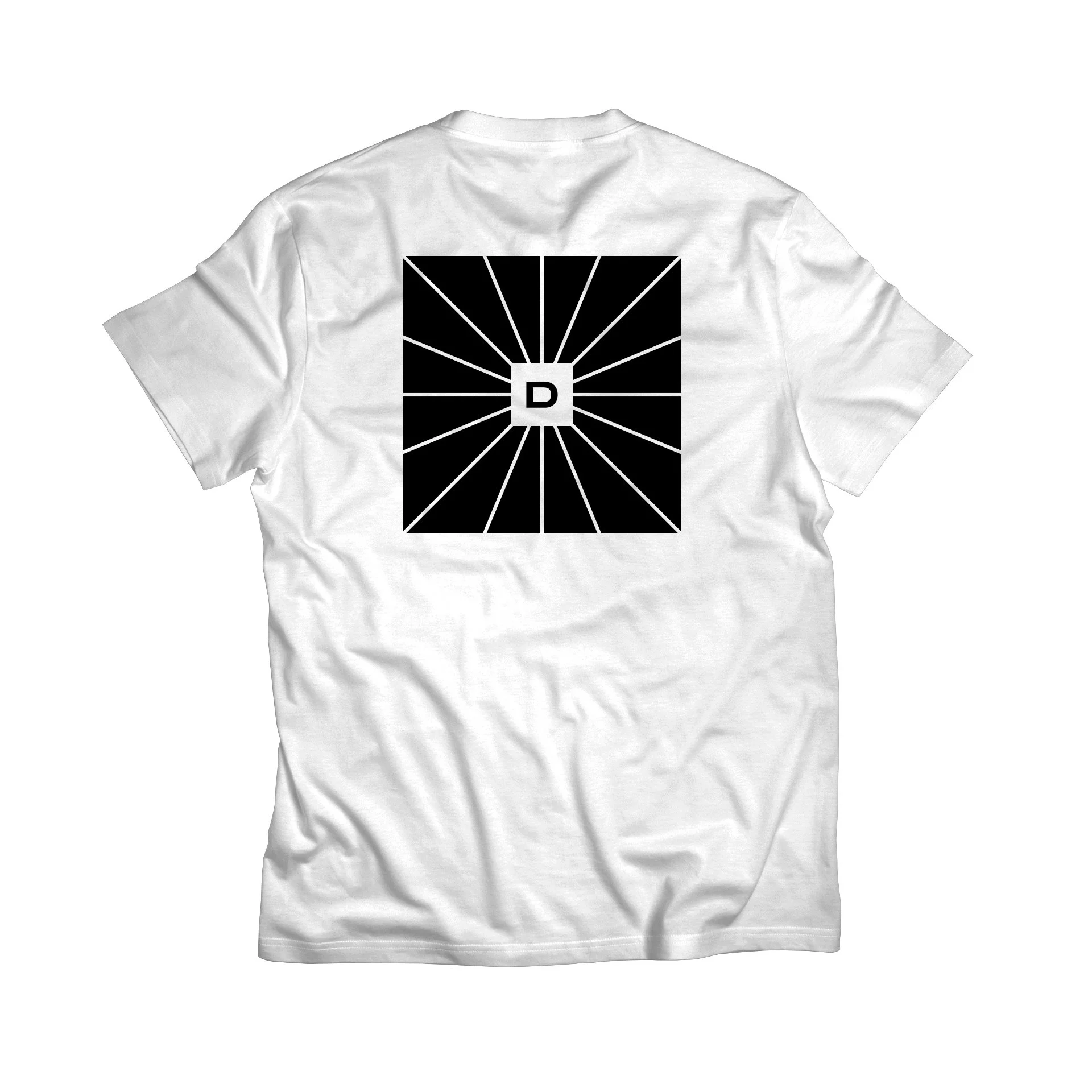
Variable logomark.
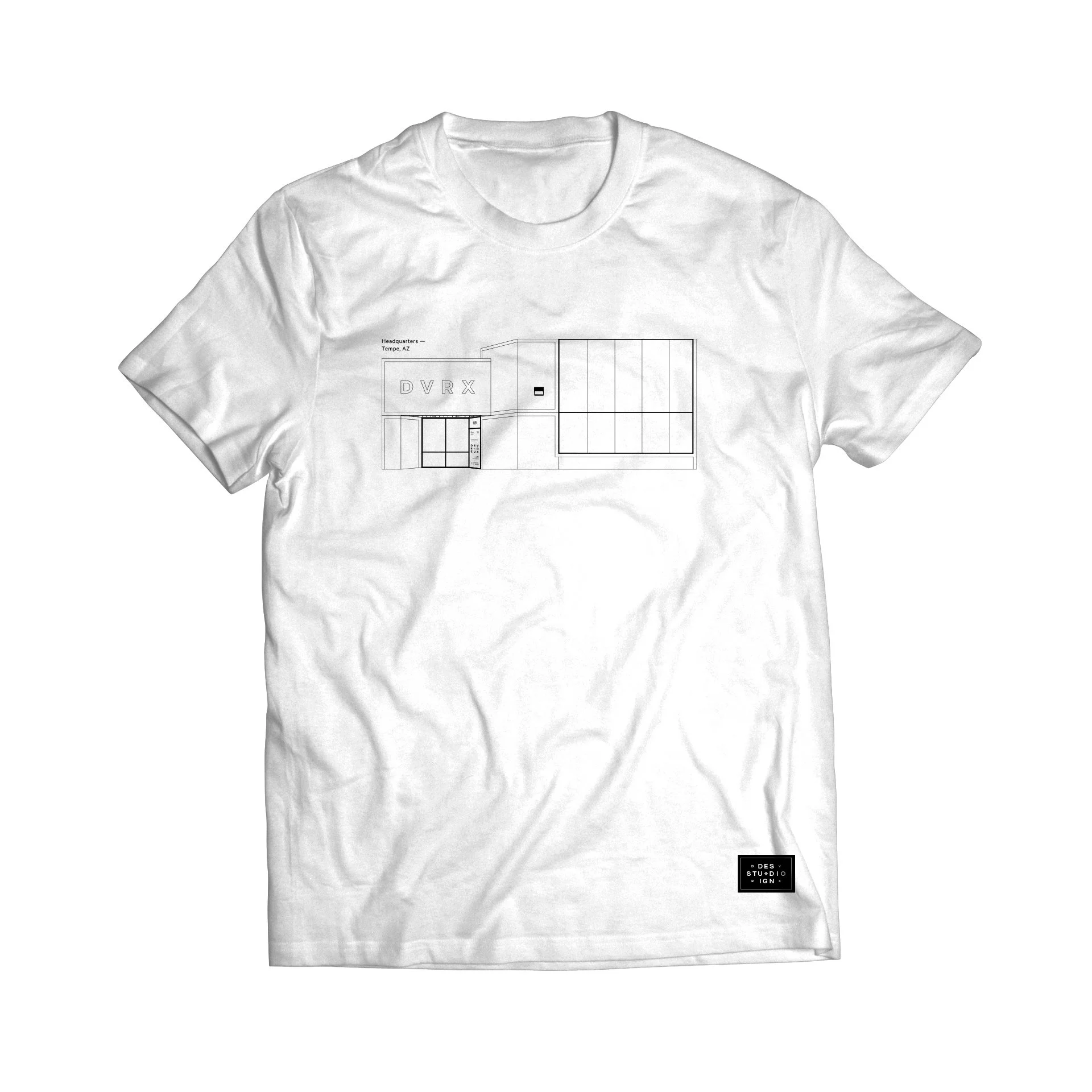
Office illustration and new brand tagline.
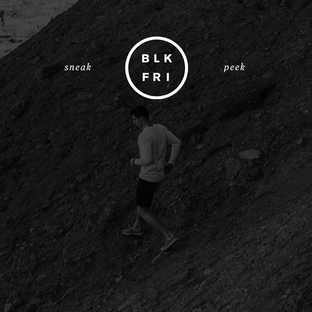
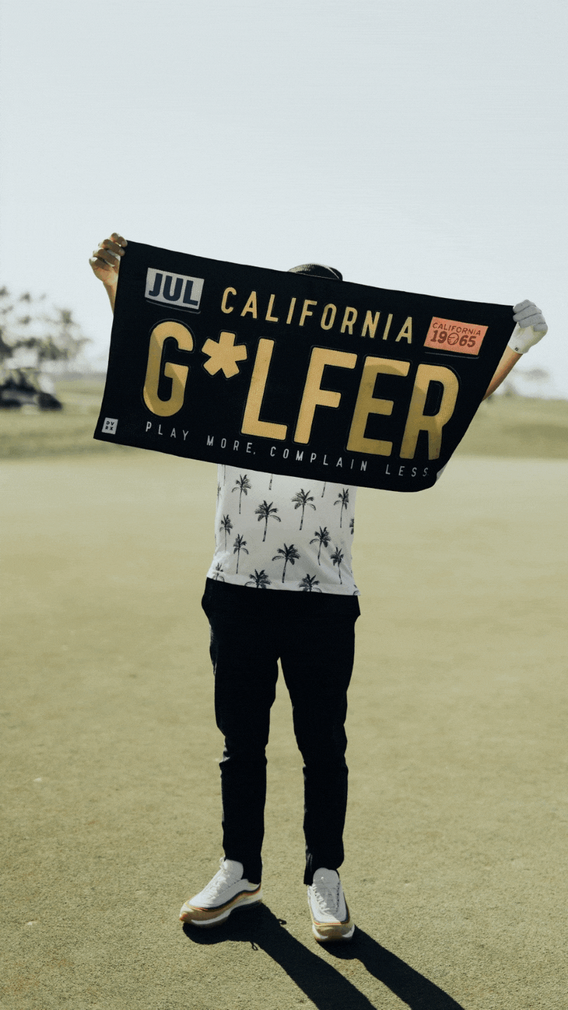
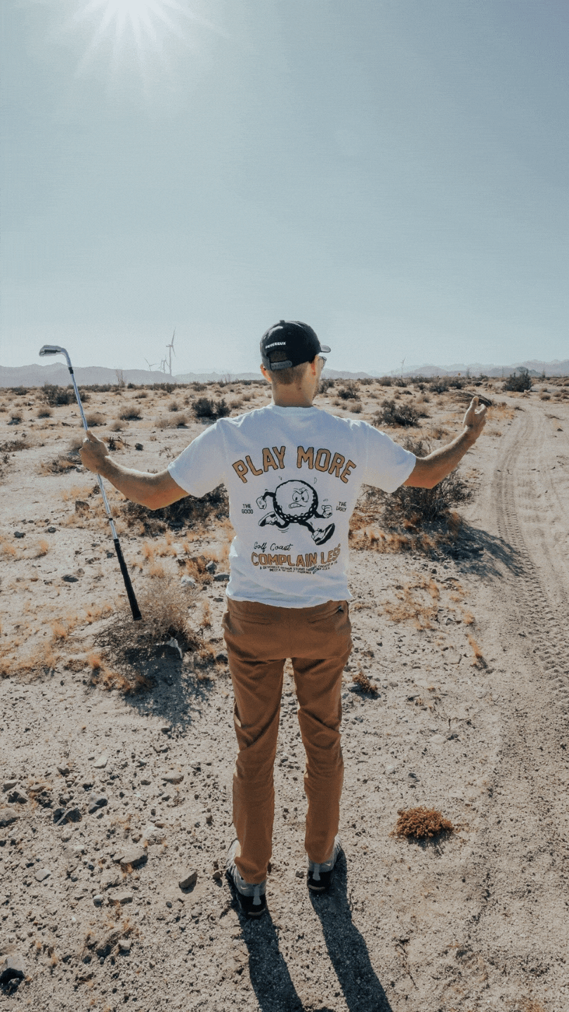
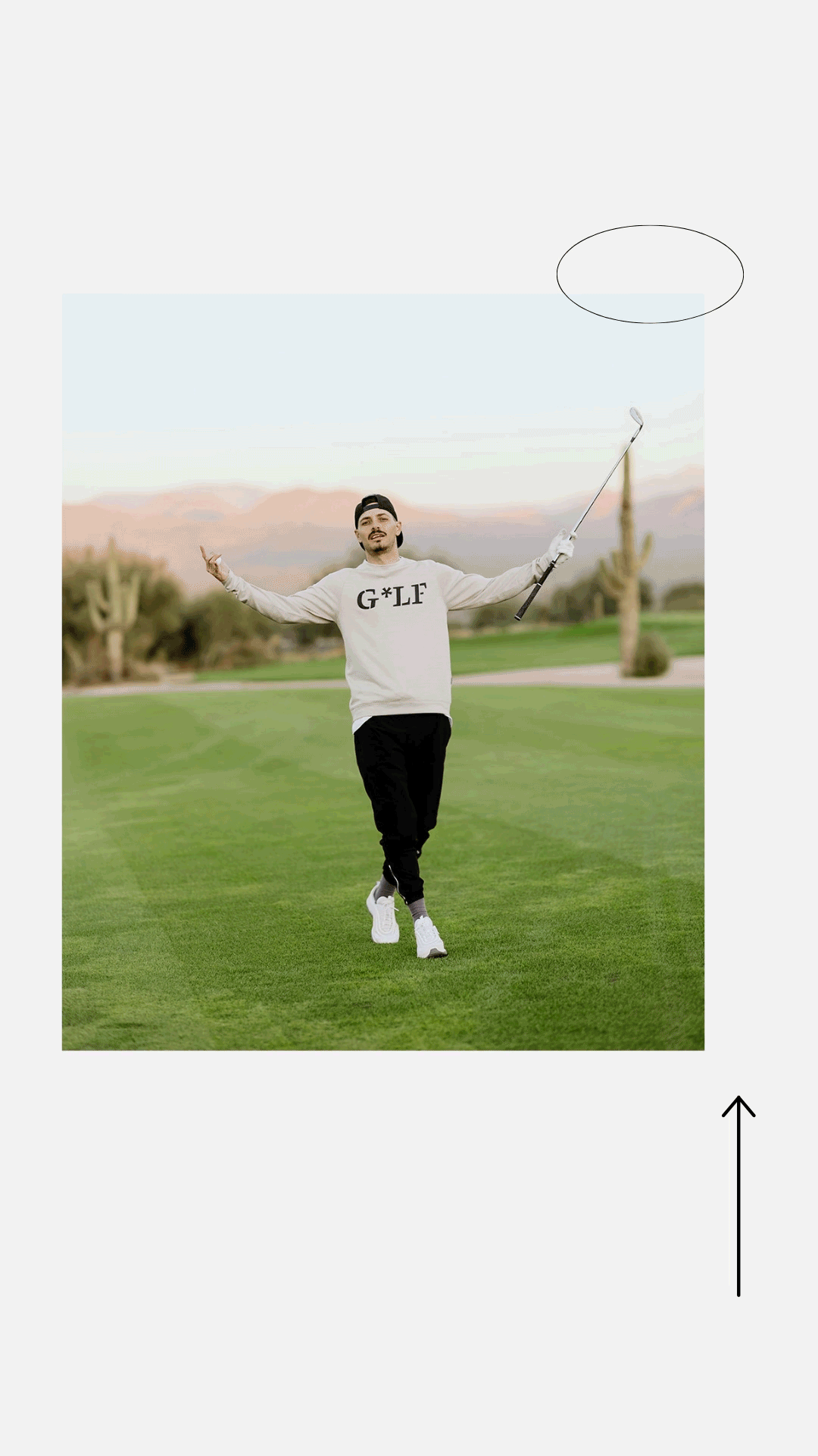
As the rebrand took shape, our focus sharpened: we weren’t just updating Devereux’s look—we were redefining its role in the culture of golf. The shift opened the door for a more expressive, contemporary design language that challenged long-standing expectations of how golfers should look and show up on the course. Instead of catering to traditional norms, we leaned into the communities and subcultures already reshaping the sport from the ground up—using their influence to help define a new standard of style on and off the course.
This clarity gave us permission to be bolder. Collections became opportunities to introduce fresh perspectives, tell stories, and broaden entry points into the game—both stylistically and economically. One defining moment came with our Peachy capsule, inspired by the food traditions of the Masters Tournament. That drop helped solidify our new direction and earned national attention, including coverage from HYPEBEAST in April 2021.
WORK COMPLETED
Establishing brand fonts, typography, and visual standards
Developing new brand elements and expanding the visual system
Creating custom patterns, brand mascots, and character illustrations
Photo retouching, color correction, and product isolations for lifestyle, e-commerce, and line sheets
Assisting on photo shoots and preparing assets for PR partners
Product illustration and development
Packaging, label, hang tag, and tag design
Product mockups and digital screen mockups for web and video
Print collateral, signage, stationery, and event materials
Bag stuffers, thank-you notes, parcel bags, poly mailers, and trailer wraps
Stickers, promotional materials, and various printed assets
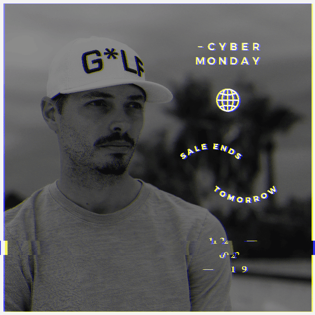
Creating custom social content for launches, sales, holidays, and events
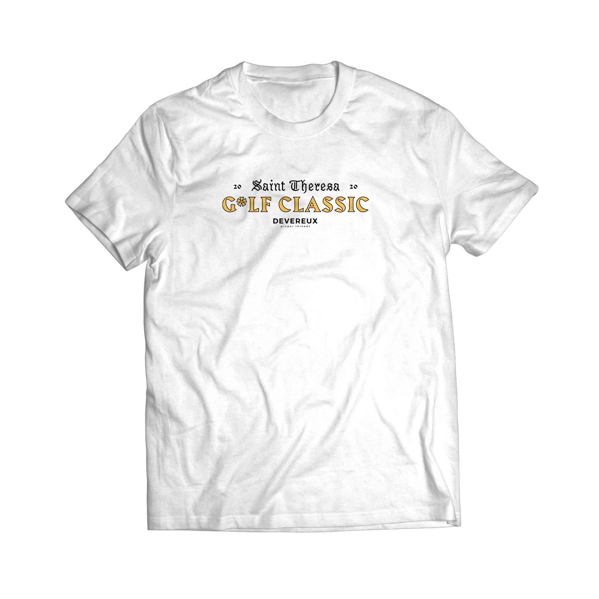
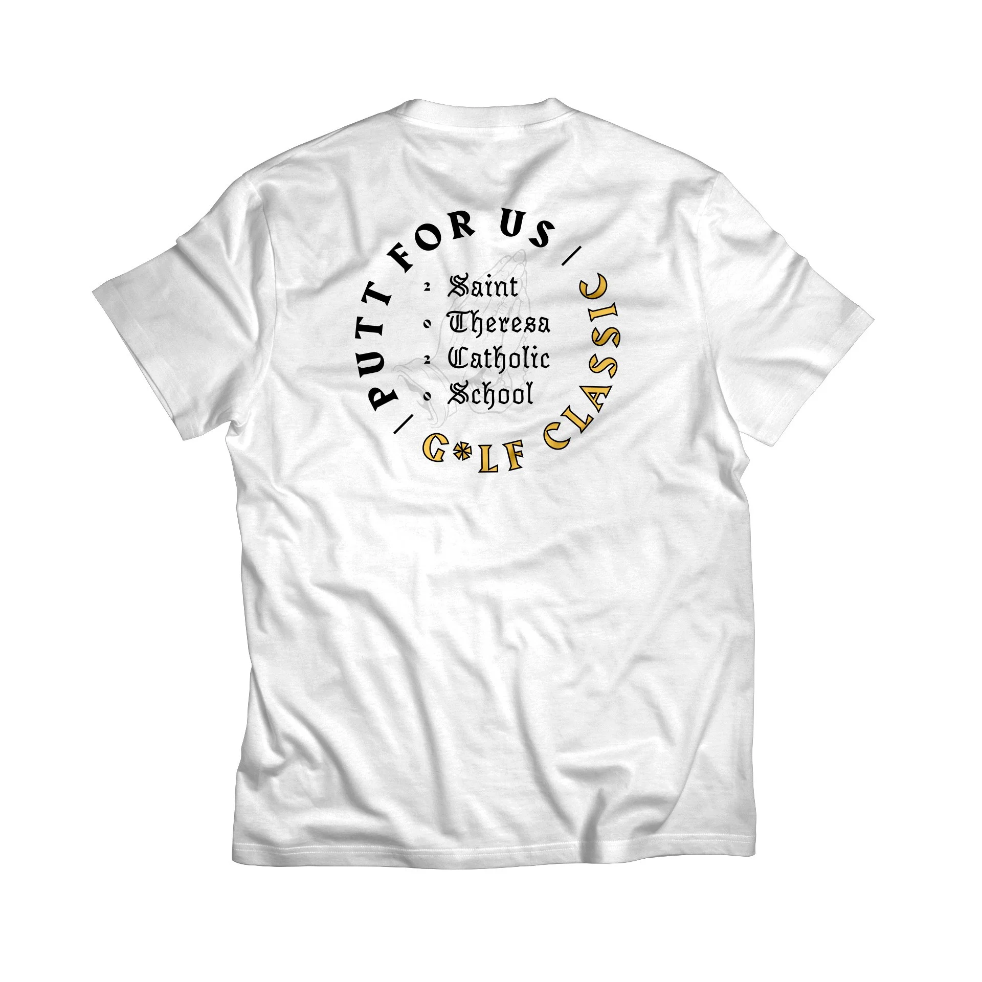
Designing promotional graphics for tournaments and brand partnerships
Producing website headers, email templates, and digital content
Writing copy for campaigns, product drops, and marketing materials
Creating logo options for local golf courses
Supporting collaborative projects with partner brands and events
Warehouse operations support
IT support
Event support
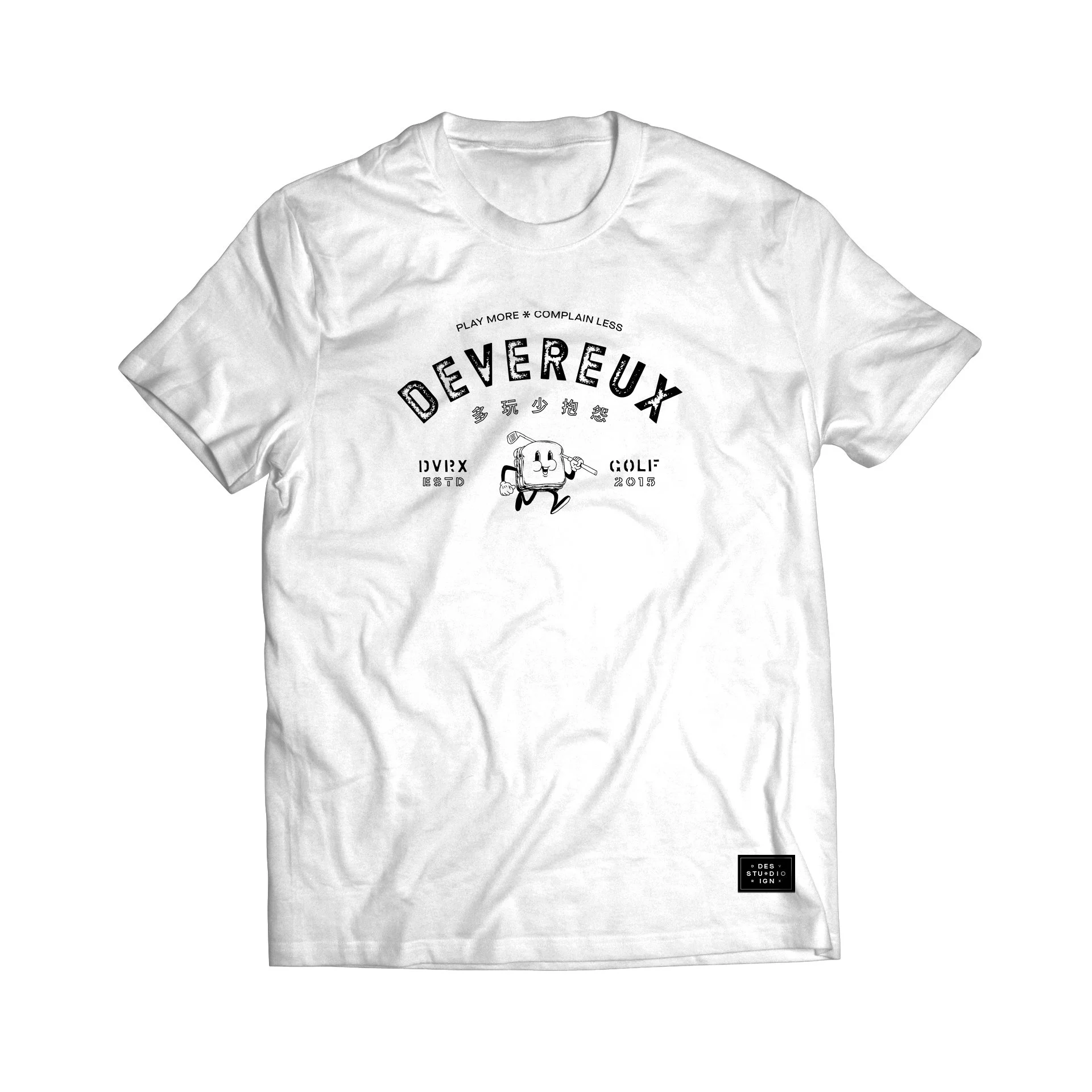
Brand mascot based off of the pimento grilled cheese served at the Masters' tournament.


Click or drag sides of pages to navigate.


Click or drag sides of pages to navigate.