CREATIVE DIRECTION
SHOWIT
EXPOSITION
Designing the designers’ playground: leading the creative vision across a platform built for creators.
Showit is on a mission to cultivate the creativity that exists in every person. The design app experience makes it possible for anybody to grasp a handle on how to design for web and unlock their ability to play without as many constraints. While I was the Creative Director at Showit, part of my responsibility after leading a team-wide rebrand was to use our design app to redesign a handful of our most high-traffic and top-priority pages. Overseeing uncountable efforts, below are a few pages and other various projects that I ran point or was lead Designer on.
Original pages I designed (above) vs the live versions w/ minor adjustments made (below).
Design & copy. Visit the live Pricing page. Notable contributor of development: Jessica Reklaitis.
Design & layout/grid/preview system. Visit the live Design Market page. Notable contributors of development: Kat Randall & Keegan Lambert.
Design, copy & development. Visit the live Industries page.
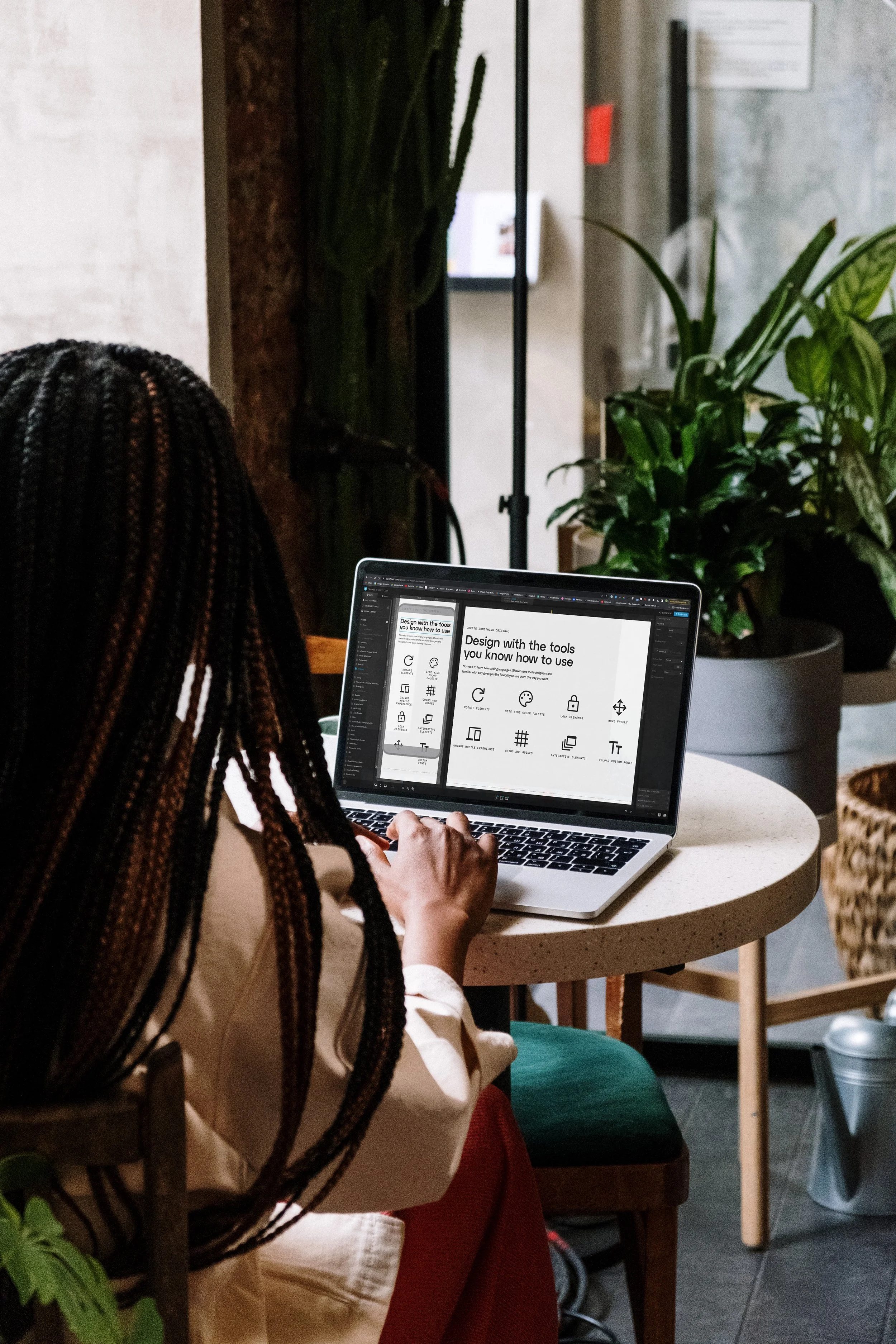
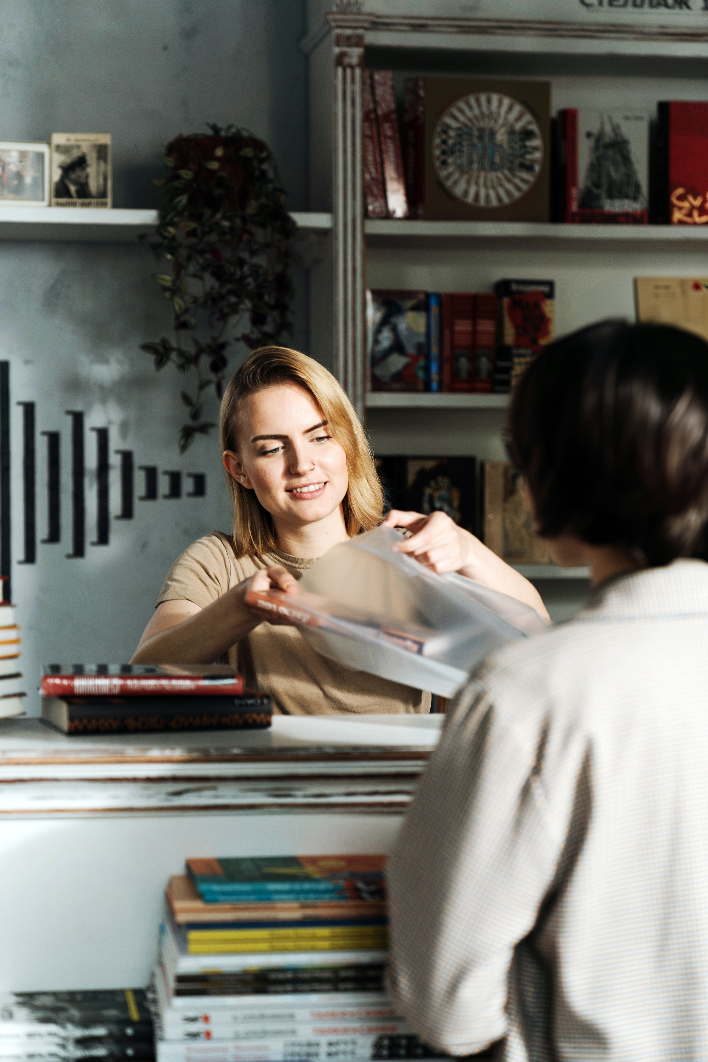
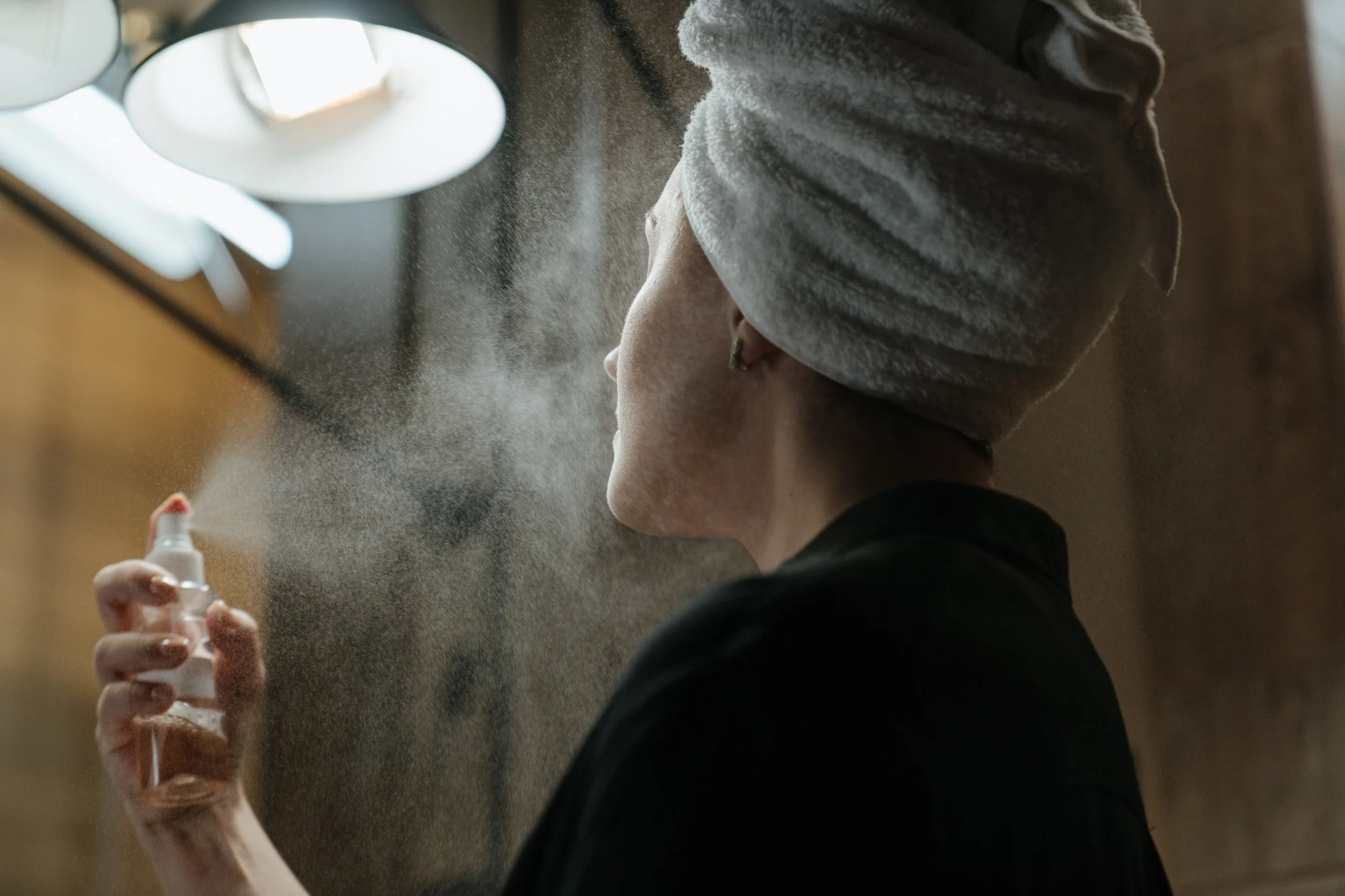
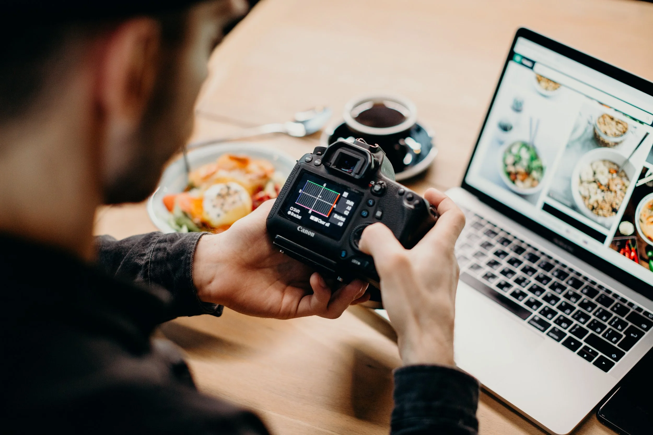
Below: Directed and selected photography styling for the Industries page. Several of which included editing to place Showit content on screens, changing funky hair styles, removing unwanted aspects like heavy reflections, color correcting, and creating more content in select photos than previously existed for better options to crop on the landing page.

Podcast landing page interface graphic.
The redesign of the Showit website was reviewed by content conversion copywriter, Annie Maguire, who had this to say about the work.
“I love that their overall language is just very approachable, it’s very conversational. It says a lot without using a ton of words—which is always the goal of copywriting—but is a difficult thing to achieve.”

— Annie Maguire
Visit the Showit Dribbble account.
I planned a strategy to utilize the Dribbble platform to get in front of more Designers to allow Showit to become a household name for anyone looking to level up their web design game. I templatized our approach for varying post stylizations (general posts/marketing initiatives, ads, store templates for sale, Design Partner features, and more).
Our advertising efforts made over 3.3+ million impressions, reaching a hyper-niche demographic that proved to amplify our voice through the word-of-mouth advertising that trickles down (referrals to clients, partners, other designers, etc). Seems like a free throw to me, minus the foul. Basketball jokes 🏀


While I was at Showit, the owner made a smart investment: buying the letter “M” so we could move from showit.co to showit.com. It was a simple shift with a huge impact on discoverability. For years, people would accidentally type or share the “.com” version anyway—even our most familiar users and partners. Sometimes coffee just ain’t enough to stay sharp 100% of the time.
The timing lined up perfectly with April Fool’s, and it felt like the perfect moment for a memorable campaign. Our team got together and quickly landed on an idea: what if we pretended we didn’t just add an “M,” but put it in the wrong place? That’s how “Shomit” (Show ’em it) was born. We rolled it out as a faux rebrand, and it sparked a ton of engagement, laughs, and double-takes from our community. You can watch the announcement video here—or in the video above.
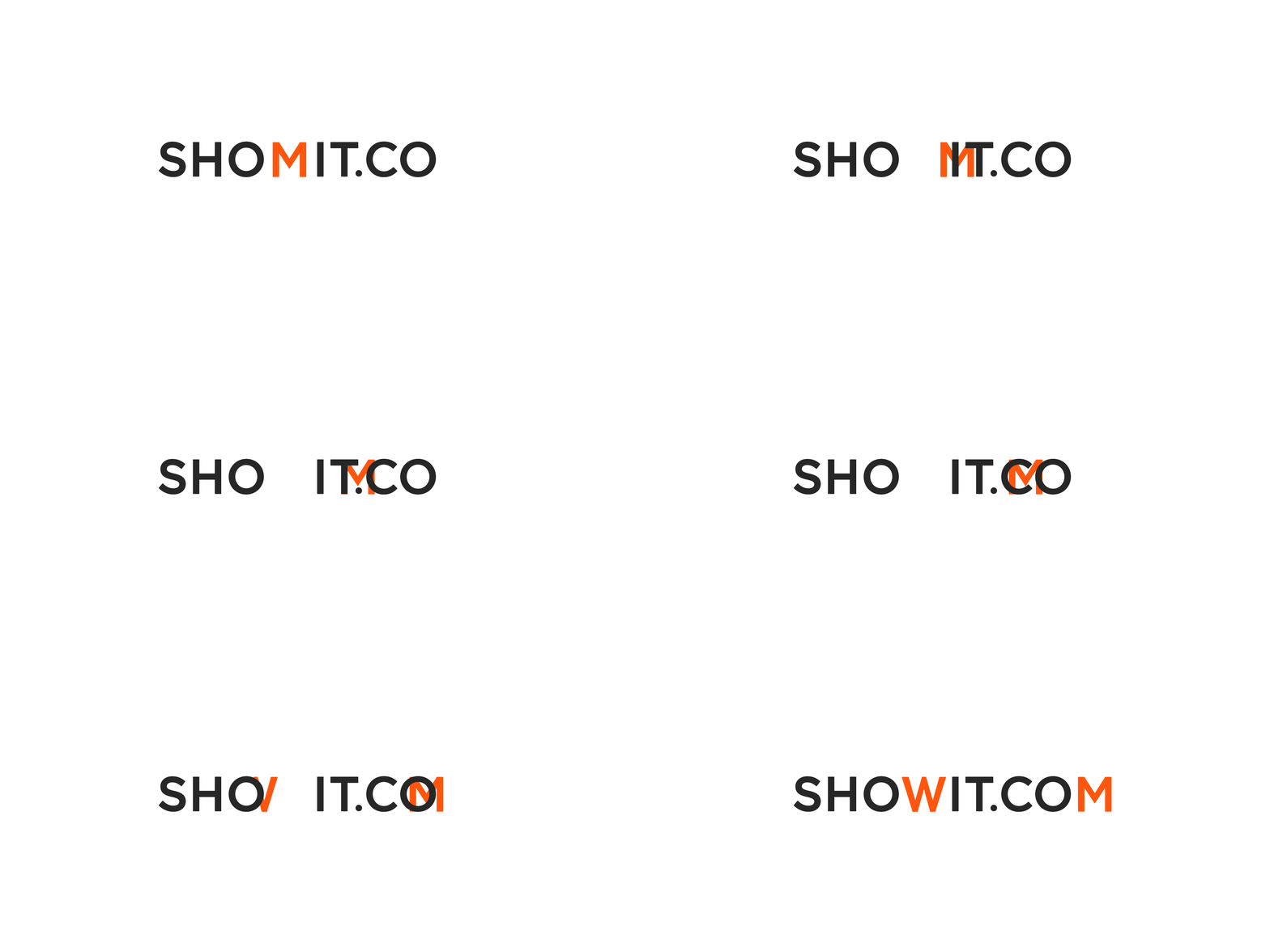
Of course, the real showit.com needed its own logotype too. The concepts above were created for that purpose: using our existing logotype, removing the “S” logomark to keep it visually distinct from the primary logo, and—most importantly—placing the “M” in the correct spot.
“I'd be happy to recommend Zach for any creative endeavor. During his time with us, he showcased his talent for creating clear, sleek designs, producing work that is sophisticated, visually appealing, and effective at communicating messages. Zach played a pivotal role in the successful brand redesign for our company that brought our public look and feel to a whole new level.”
— Todd Watson, CEO + Owner at Showit

Part of rebranding Showit included revisiting the previous Design Partner badge system and the DXP (Designer Experience) logo.
For the Design Partner badge, I aimed for visual weight balance and simplicity to ensure versatility in black and white, a single brand color, or even utilizing multiple combinations. It aligns with our design system's styling with proper color-pairing usage rules and the implementation of a singular line weight, allowing it to seamlessly integrate into our Design Partners' websites and marketing materials without distraction.
For the DXP logo, I drew inspiration from the previous version but opted for a custom lowercase font design to enable seamless and infinite rotation on the DXP landing page, ensuring a perfect mirror, even when upside down.


I designed an old-school hotel key tag that we made into keychains to give to our Design Partners when we would host them at an off-site with time to rest, connect, and learn from each other.
The car freshener was mostly for fun but the idea for these was to produce them as an actual freshener and added branded touchpoint for the car ride together up to the wilderness that could also serve as a conversational icebreaker while packed together.
I dreamt up this project of movable "sticker" magnets for an experiential photo op for people visiting our headquarters. This served as an opportunity when mingling with hosted Design Partners at the office to connect around and take photos with a branded backdrop of their favorite website platform.
Responsibility for these were split across our team. I designed the I ❤️ Showit, Tap Tap, Swipe Up, Tag a Friend, Showit.com, Create Like There's No CMD+Z, Banger CTA, and Can U Make the Logo Bigger stickers. Personal favorites of mine include Font Collector, designed by Kat Randall, and Gif > Jif, designed by Jessica Reklaitis.
I wrote the copy for I Know My Quick Commands, Gif > Jif, Funktionality, Tap Tap, Swipe Up, Tag a Friend, Optimized for Web, and The Only Support I Need Is Showit Support stickers. Copy for God is a Designer, Eat Sleep Design Repeat, and Create Like There's No CMND+Z by James Nwobu. Copy for I ❤️ Showit and Go Rogue From Code by Chris Misterek. Copy + Design for Drag & Drop It Like It's Hot by Jessica Reklaitis.
T-shirt option I designed for our annual marketing team retreat.
Vintage sweatshirt made to give as a gift to our Design Partners.

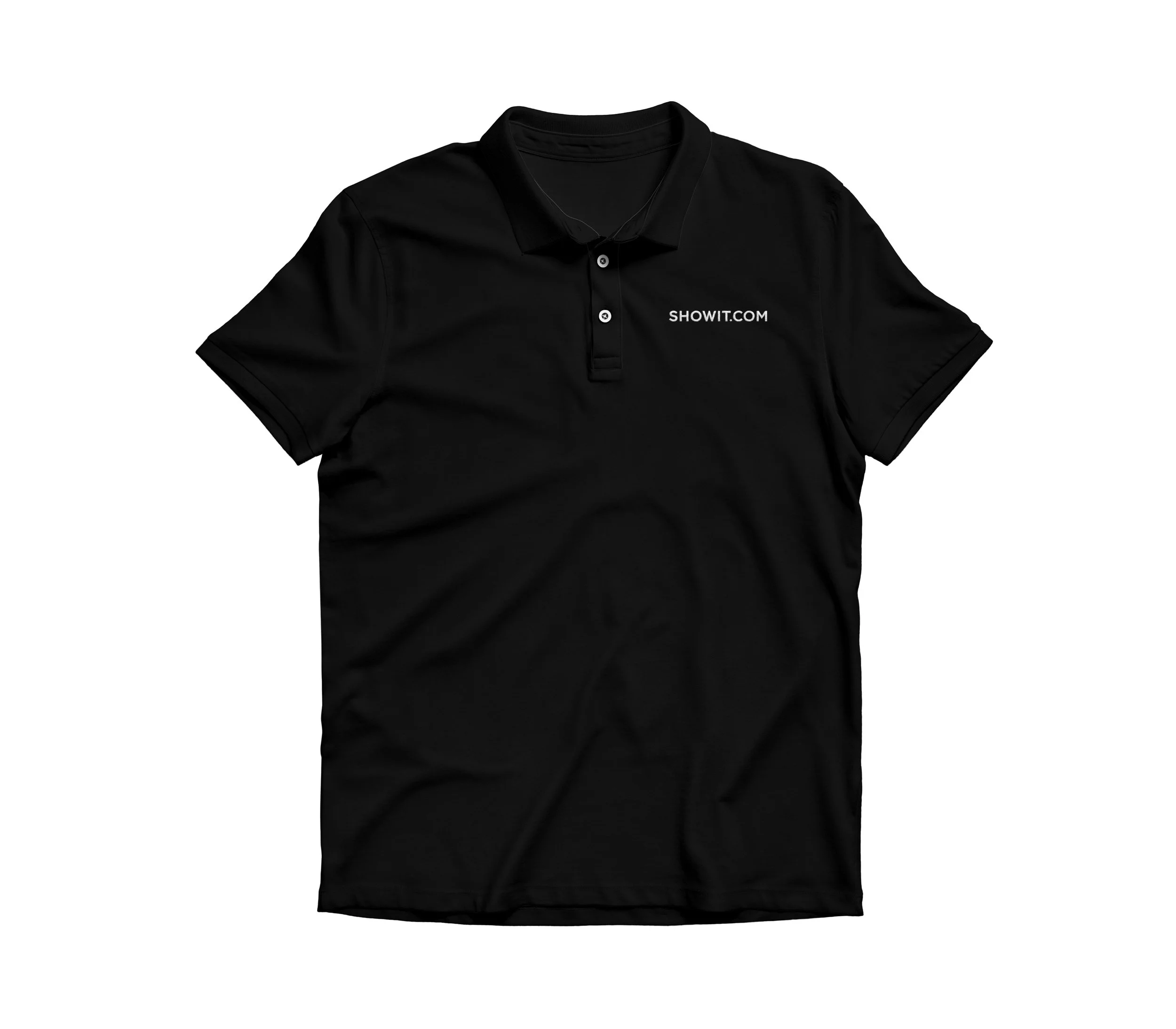
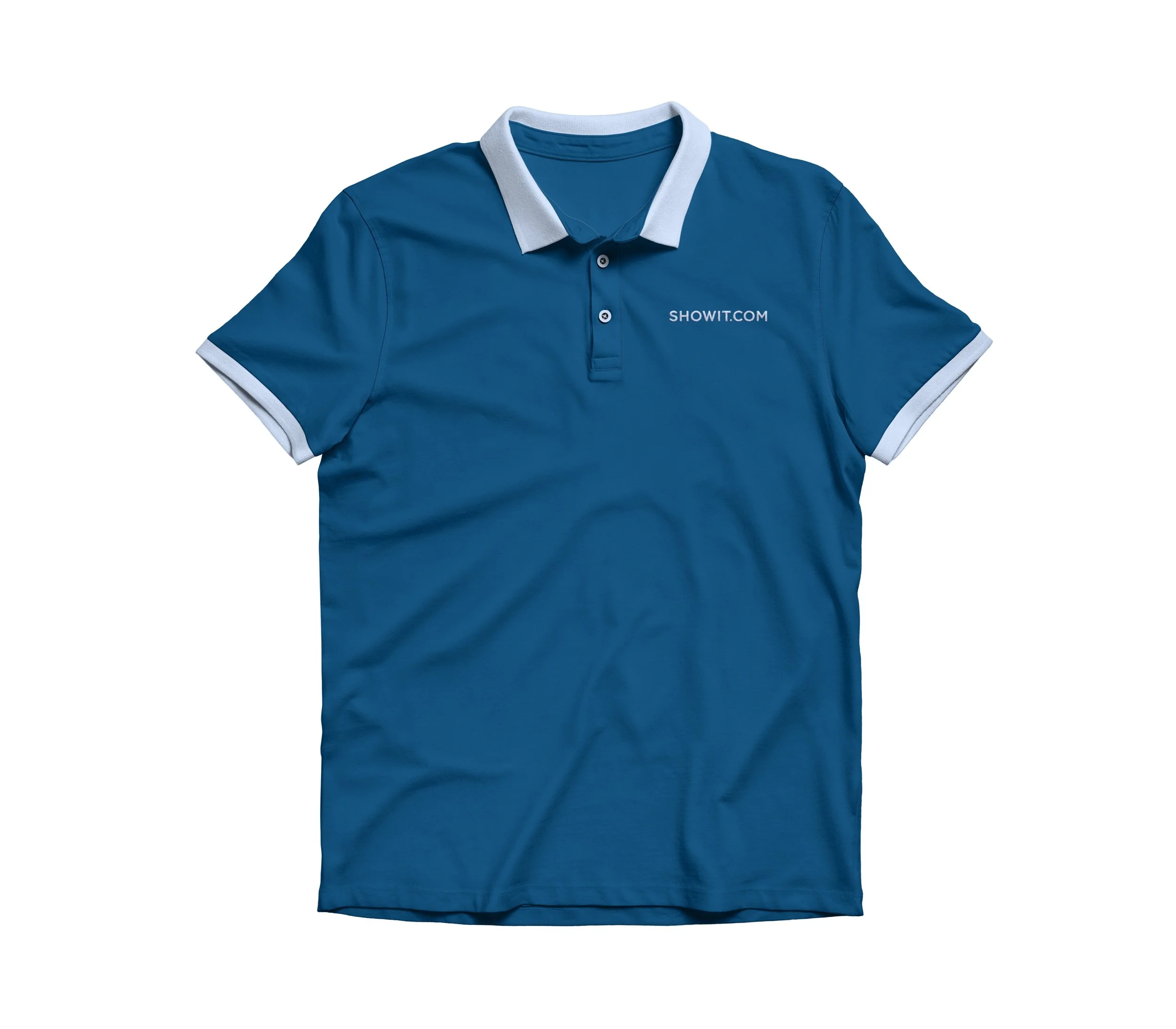
Embroidered Showit.com polo designs.
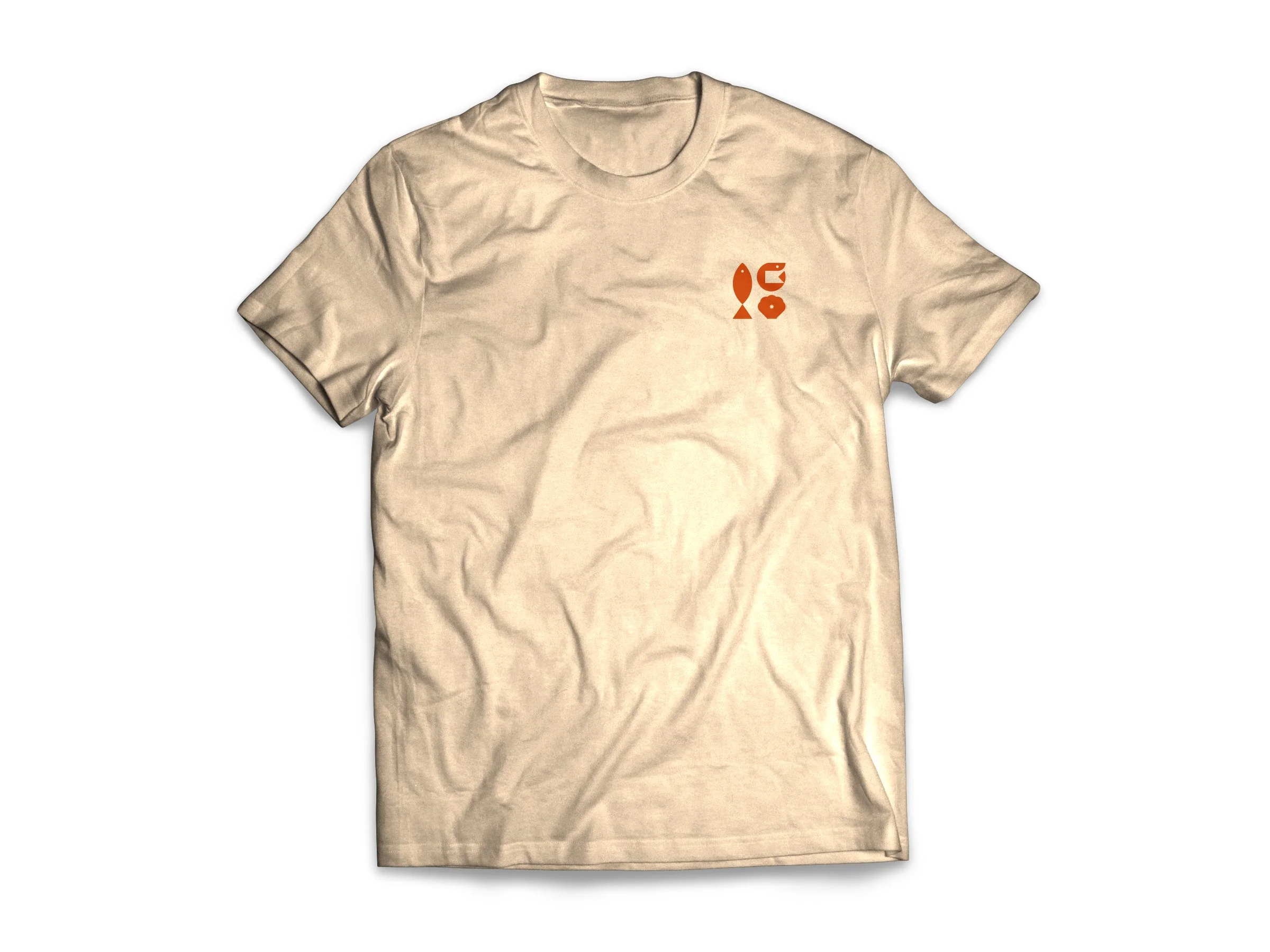
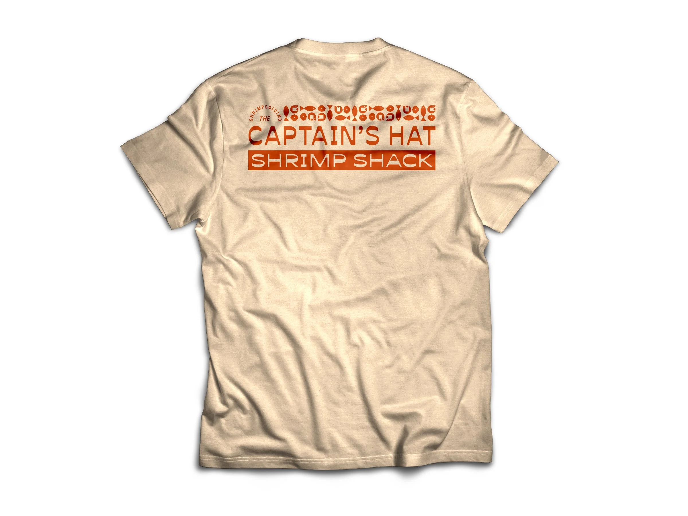
Every year, instead of celebrating Thanksgiving in the traditional way, Showit hosts a "Shrimpsgiving." The rule for this event being that every dish prepared be themed–or even more preferably–made utilizing shrimp. It's a heck of a good time with games, prizes, and camaraderie among colleagues. This was a t-shirt option I designed for it. I created the design for the year as if it were a restaurant, paying homage to our founder, who was known to dawn thematic hats that he would wear for fun occasions.
Pins I designed for Phoenix Design Week UNITE ‘23 sponsor booth giveaways.
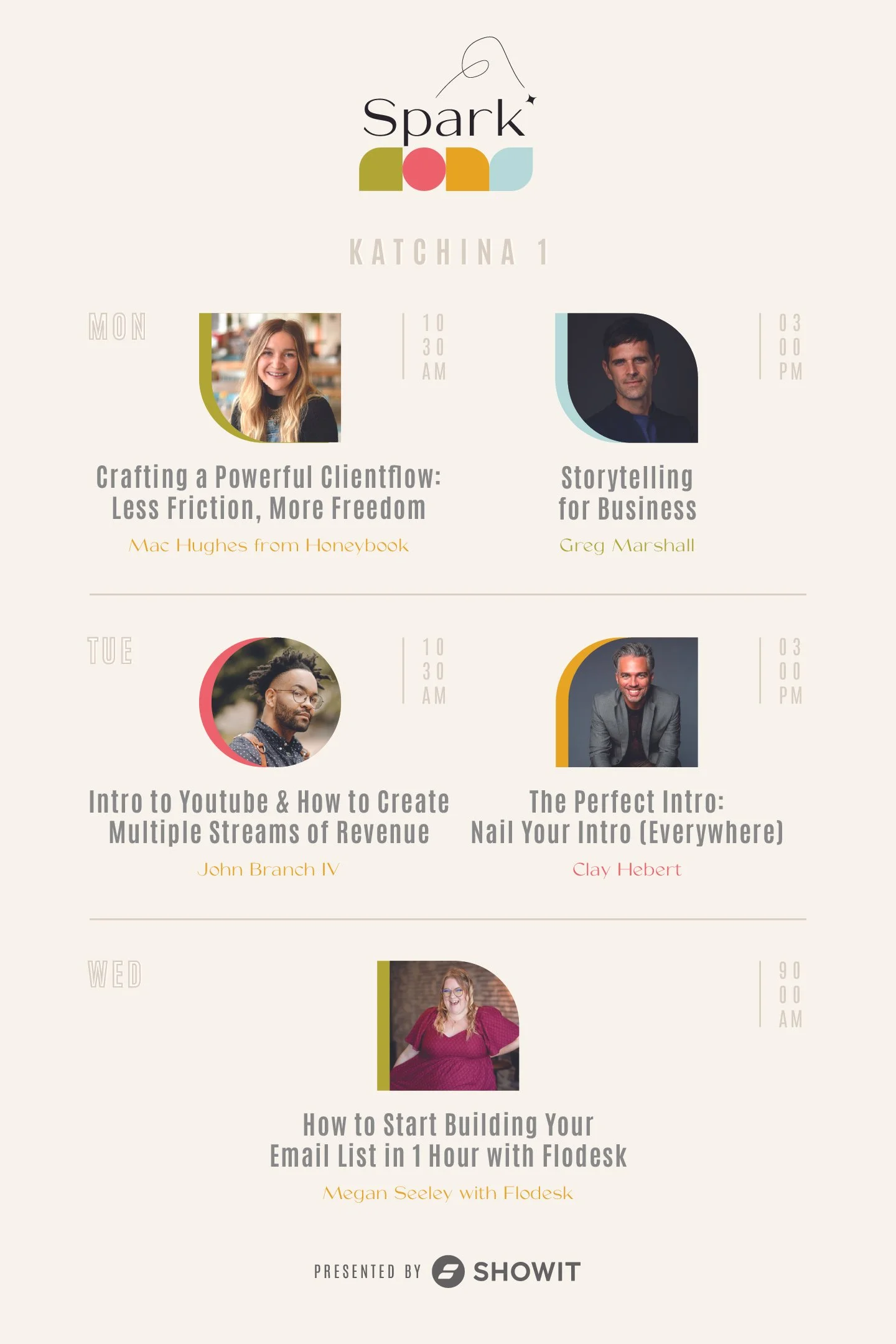
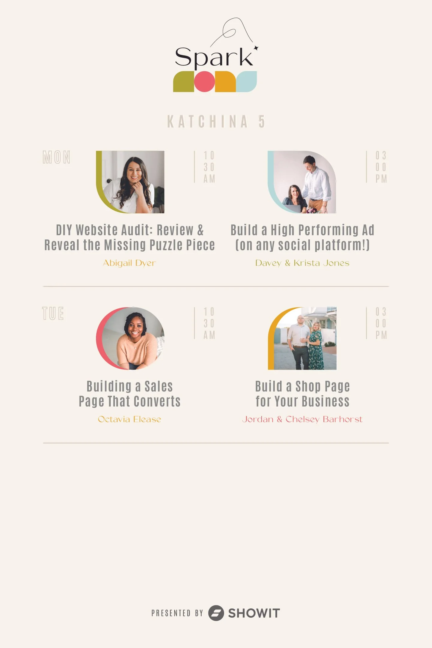
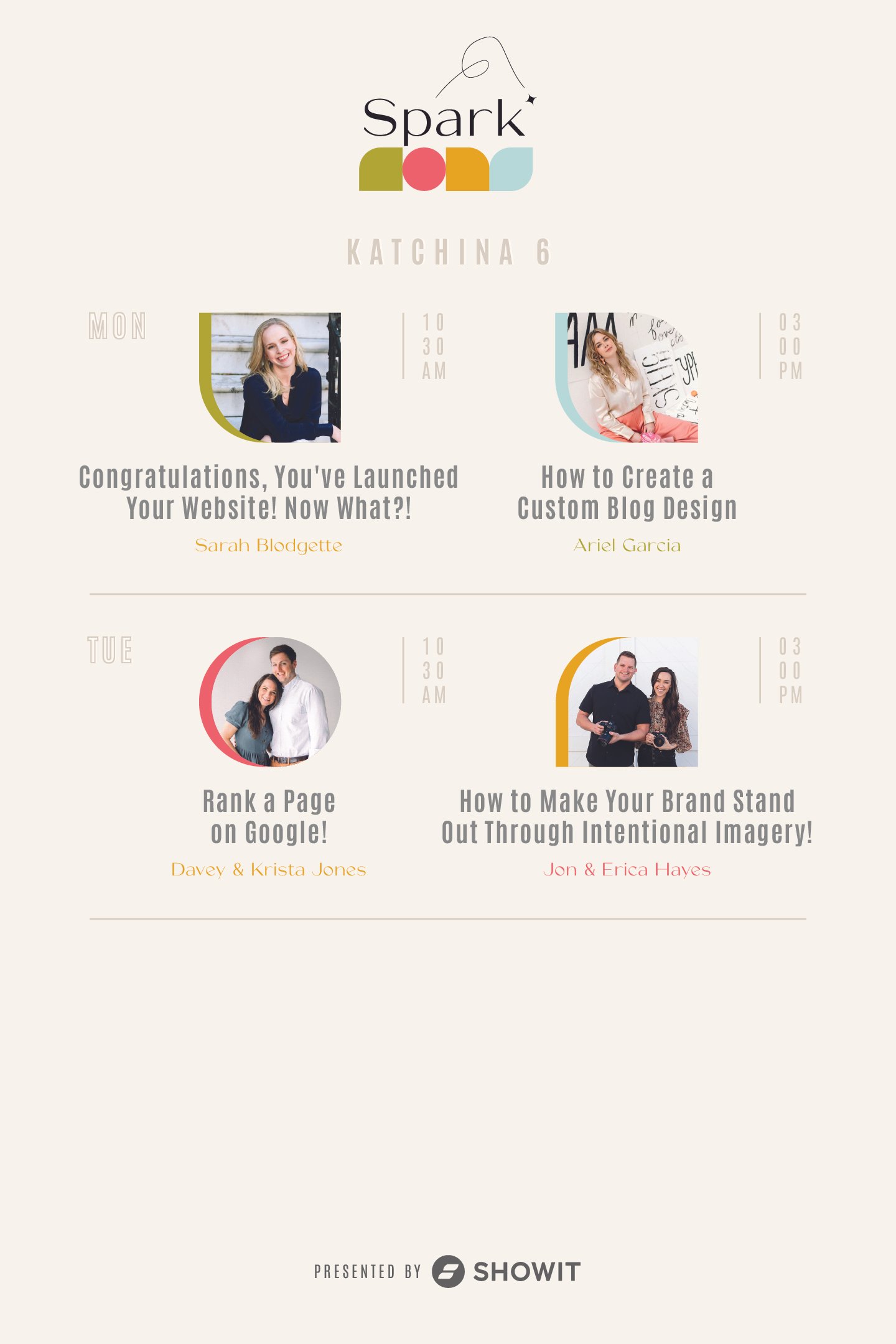
Logo concept for Spark ‘24 branding. View the Spark page. Below are a handful of processed images for Spark ‘24 branding and marketing materials. 135 total created images.
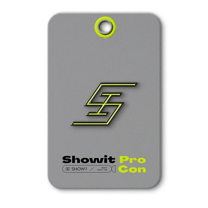
Unused concept for conference branding.
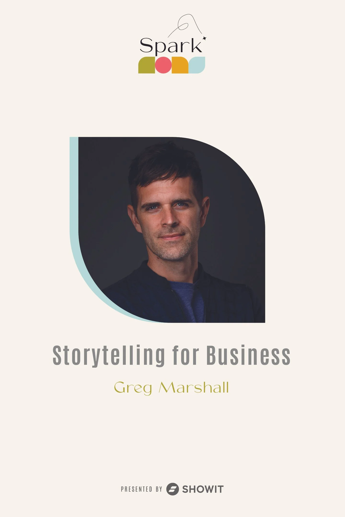
Spark '22 branding and select presentation slides. Spark ‘22 logo designed by Jedidiah Smith – slides and other event materials completed by Kat Randall, Jessica Reklaitis, and me. I'm only showcasing materials I produced.
Lanyards and badges produced for various attendee types for Spark ‘22.
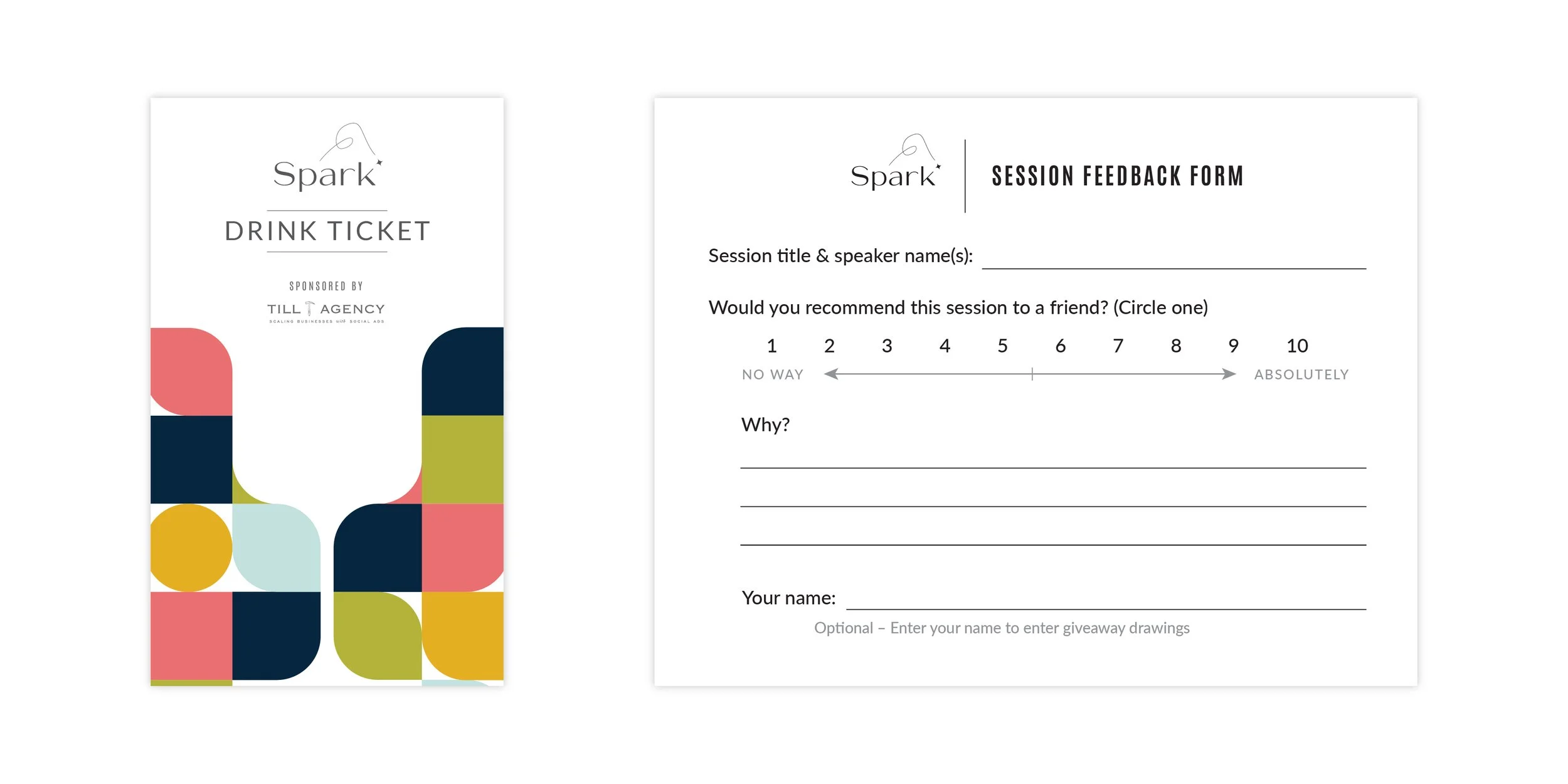
Drink Ticket and Session Feedback Form.
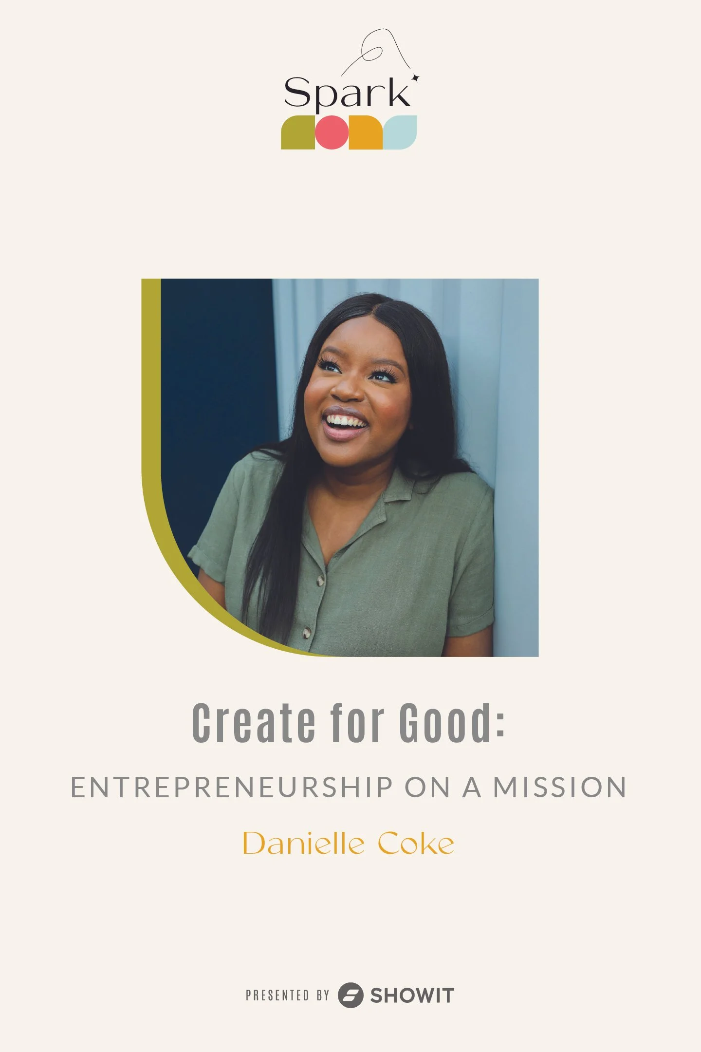
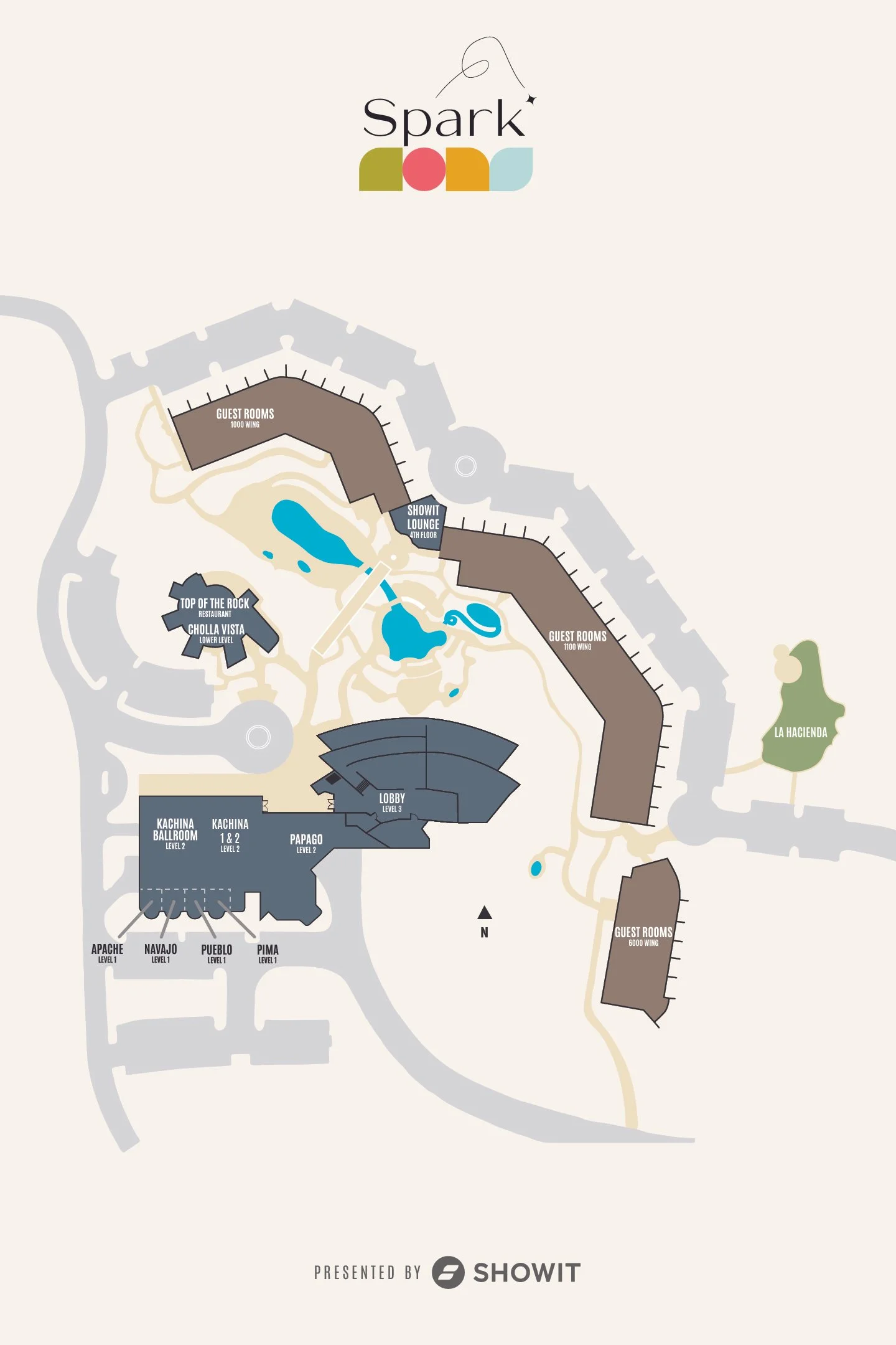
Way-finding and event signage for Spark ‘22. Some fun moments of copy can be found on a few 😁
Moment connecting with Showit users and Spark ‘22 sponsors, Tonic Site Shop.
Conference wrap photo.
Showit office entrance door graphics.
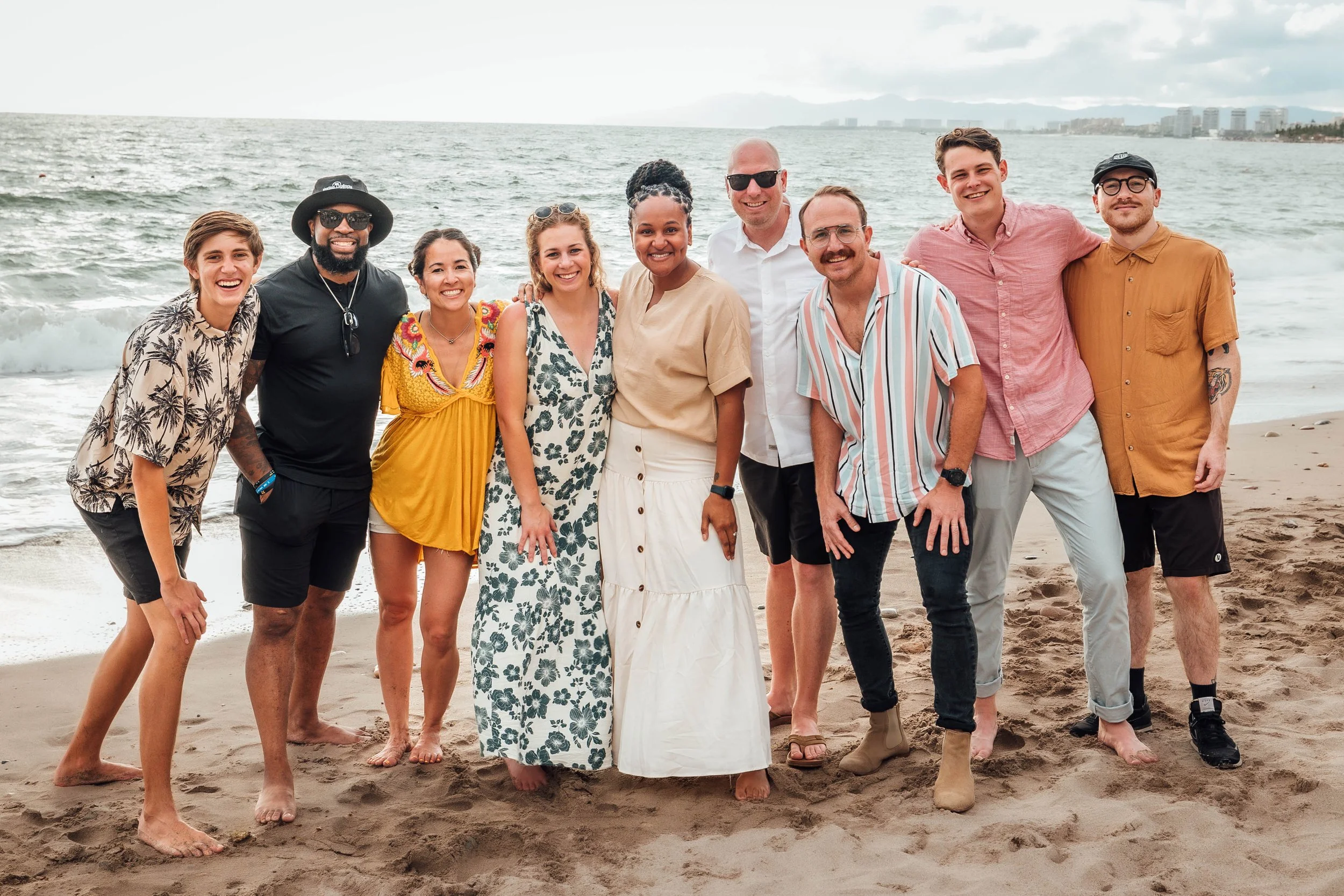
The marketing department at our annual retreat in Puerto Vallarta.
